The effects work of the weapon, the environment, and killing things is perfect. Very nice work.
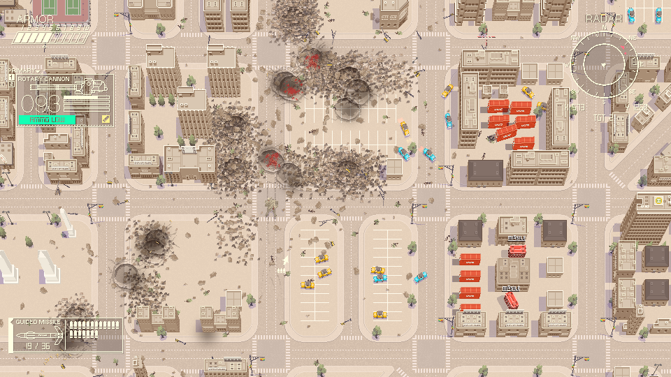
Needs more visual clarity. Saturation and luminance can help a lot here, if you want to keep things beige. The player, environment, and enemies all sit way too close to each other. For a game, readability is more important than almost anything. Not being able to easily pick out yourself, the enemies, and the obstacles feels like fighting against the game, not against the enemies.
UI needs a hierarchy. Everything is the same size, same color, etc... Make the most important parts much more obvious. When you lose health, they can flash red. When you spend ammo, the ammo counter can shake or something.
I'd personally soften the aim tween. It feels too chaotic as you're trying to move around. You could either limit cursor speed, or keep cursor speed, and just make the camera a little more floaty. Not sure which would be better.
Gameplay wise, I think it has a good feel but might need some more elements. The core moment-to-moment play might need a dash, or a shield, or sprint, or something like that. When you start adding higher level goals and such, it will help, but I think you'll still find that something is missing.
Start the game fullscreen. I think it's a big mistake when games start windowed. It's saying, eh, this isn't very important. Go check your email, go scroll social media. Fullscreen says, you've given me your attention, I will make good use of that.
Hard to talk about difficulty, because the clarity of the gameplay and menus are obscuring the issue. Once those are clear, then I think real balance work can take place.
Overall, great work dude. There's a ton of potential here. With a bit more clarity I think you have a really solid base, and there are quite a few directions you can take this in. Keep it up.
Thanks a lot for checking out and the feedback man!
Visual clarity is absolutely the highest priority thing I'm going to work on. I intend to overhaul the UI too, I think the health and such needs to be way clearer so you can just tell how well you're doing via peripheral vision. Will see if I can add multiple camera settings under the options menu too.
I did add a boost/dash function with shift, but I've been thinking if it's worth it to have a dash function by double tapping the direction keys. Might be cool if you could also ram enemies and damage them perhaps, could be an upgrade.
I'll make sure to start the game in fullscreen once I figure out the other resolutions scaling correctly. Game is 960x540 so it doesn't always scale correctly to 16:9 resolutions other than 1920x1080, but I don't want to drop the size to the more used 640x480 as I think that's too small for the type of art I want to draw for each screen and the general gameplay style.
Thanks again for the feedback! Will keep all of it in mind.
For fitting screens while maintaining an integer scaling value, what I did was set an upper and lower breakpoint for width and height, for each scaling value. Meaning, if the game window is under say 1080x640, you go 1x. Once both width and height are above that, pop into 2x. Same for 3x, all the way to 8x. It takes some testing, but once you get the values right, the game will look good and crisp on nearly every screen. The vast majority will have the entire screen filled, a minority will have some letterboxing. Look here for what resolutions are worth testing up front (you can expand the display resolution line item):
This game has insanely high GMI energy from the audio and aesthetics but I got filtered pretty hard by the gameplay.
The camera movement made me pretty nauseous. Which is pretty weird since games usually don't do that too me. I was playing with vsync on too for reference. Maybe add a camera sensitivity option?
Enemies were pretty much impossible for me to see especially once rubble / blood starts piling up. You gotta make them stick out a lot more by either giving them flashier colours or applying an outline shader on them.
Really looking forward to how this project progresses. Keep it up!
Sorry to hear the camera movement made you nauseous. Was there any delay/input lag? When I turn on the alternate v-sync on my end it kind of adds a motion smoothing effect to the cursor position, I can see how that'd make one nauseous. I thought about maybe adding a slider that controls the camera speed, but having instant movement is kind of needed for the combat.
My highest priority is definitely going to be improving readability, it's easily the thing that needs to be worked on the most. Thanks for the feedback and kind words!
Hmm, Brigador but in extremely fast? Your graphics are awesome, gameplay... it's fun, but a bit one-dimensional. Kiting the enemy horde in circles seems to be all I can hope to do. Idk, did not understand if there is a way to win missions currently? At least I got one run in where I survived until out of ammo.
Definitely has the potential to become a great game, I'll be interested to see how it will be fleshed out.
Heya, sorry about that. Watching your footage, I saw enabling V-sync can speed the game up stupidly fast depending on your processor. You were playing on basically 144 frames instead of 60, really sorry about that. Though in a way it's almost funny, makes it seem like sped up tilt-shift footage when it's going so fast. Hope on your end the game also displayed correctly, looking at the recording it seems slightly off-center/in the corner; if possible maybe try loading it up one more time without the v-sync on if the tearing isn't too bad, just to see if it plays at normal speed.
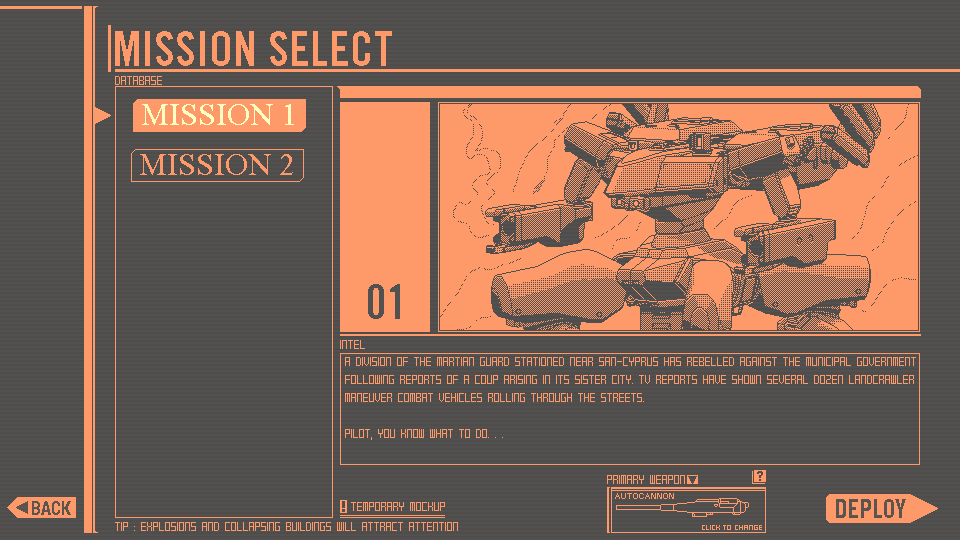
There is a win state, the first mission after you wipe out 24 enemies, the second after you wipe out around 400.
Again, really need to put a disclaimer that the v-sync method can mess things up, sorry again and thanks for playing!
Pretty cool game. I have all the cheevos in Brigador so I had to give this game a try.
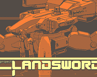
The Landsword reminds me a little bit of the personal tanks from Ghost in the Shell.
On a similar note, the presentation of the game is fantastic, although I would like to see a bit more contrast for the radar. I'm ok with mechs blending in with the urban environment since they are supposed to be camouflaged, but I think the radar could at least have a little animation or sound to indicate when an enemy is in close proximity since ideally combat takes place at long range.
The second mission having organic enemies is a nice touch. Maybe that can make for interesting loadout choices down the line.
The Landsword reminds me a little bit of the personal tanks from Ghost in the Shell.
Definitely some influence from the Tachikomas and the heavier Fuchikomas, there's some Patlabor inspiration there too.
I'm ok with mechs blending in with the urban environment since they are supposed to be camouflaged,
Yeah, it's not great for readability but in my head I kind of justify it like that. "You ever see drone footage of a war? Do you have any idea how hard it is to actually spot an enemy tank in that footage? That's the point, they're camouflaged for a reason!".
I think what I'm going to do is add solid black outlines to the enemies. Maybe it'd even make it lean more into the anime inspiration, making it seem like the buildings are "background" cels and the actual animated stuff has the outlines. Will definitely add more indicators and probably a larger radar display too, I think it should be a lot more readable at a glance as well.
The second mission having organic enemies is a nice touch. Maybe that can make for interesting loadout choices down the line.
Glad to hear you liked the second mission. There will be many more weapons to choose from and also a better, non-rushed map hopefully.
I did a number on those buildings. Explosion, debris, blood splatter, all great, UI animations with 1 bit pixel art looks great, awesomely stylish.
Osur said the same thing as I was feeling, it's hard to see your opponents. Many times I had to confirm that the enemy is in my vincinity by looking at the radar. I almost want to say that it's too small but I'm not that sure about it. Still, other mechs need to have something that will make them visible. Painting them red would be almost too easy, maybe adding some UI elements like crosshairs from fighter jets?
I felt bad about destroying the city, moreover in the second mission where I was trying to protect the gardens. And what mutated lobsters wanted? Piece of me, of course! I got A+ on both missions, now be honest with me, it always says A+ right? There's no way that half-leveled town and a destroyed garden I was supposed to protect would give me that high score.
One enemy didn't want to drive into city from the left side. I killed everyone else and had to shoot missiles blindly into OOB area hoping to destroy him.
I feel like the game is already half way there! 3 more biomes, 5 missions for each one, one random generated level with presets and you're ready to ship! Just make those mechs more visible!
I did a number on those buildings. Explosion, debris, blood splatter, all great, UI animations with 1 bit pixel art looks great, awesomely stylish.
Cheers!
Many times I had to confirm that the enemy is in my vincinity by looking at the radar. I almost want to say that it's too small but I'm not that sure about it.
I think it could stand to be slightly larger too honestly. I've been trying to strike a balance between large enough that it's easily readable, yet also not covering too much of the screen for the player. Will be working on making the enemies stand out more, I'm going to try black outlines and larger arrow indicators.
I felt bad about destroying the city, moreover in the second mission where I was trying to protect the gardens. And what mutated lobsters wanted? Piece of me, of course! I got A+ on both missions, now be honest with me, it always says A+ right? There's no way that half-leveled town and a destroyed garden I was supposed to protect would give me that high score.
You're spot on, it always gives you an A+ rank haha. I just haven't decided what should count for a good/bad rank. Time? Amount of hits taken?
Early on I thought it could be related to the amount of destruction caused, but I think it's unfair to penalize the player for having fun, especially as a lot of the destruction can be caused by the enemy. It's just impossible not to wipe out some buildings while playing.
One enemy didn't want to drive into city from the left side. I killed everyone else and had to shoot missiles blindly into OOB area hoping to destroy him.
Sorry about that! It's really rare, but occasionally they can spawn on top of each other and get stuck, but if it was just one something must've broke in his pathfinding. Will make sure that can't happen, it sucks to throw away a good run because someone decided not to join the battle.
I feel like the game is already half way there! 3 more biomes, 5 missions for each one, one random generated level with presets and you're ready to ship! Just make those mechs more visible!
I could see an endless mode working with buildings that reset. I'll definitely have more biomes and different kinds of missions, thanks for the kind feedback and playing!
this is a phenomenal looking game. from the gameplay to the UI, you've really done an excellent job. i tried both missions, i got A+ on the first one and i failed the second one a few times in a row.
from my time with the game i had two major issues:
readability and encounter design.
for readability, in the first level, the sand colored mechs are in the sand colored streets surrounded by sand colored debris. the biggest indication that an enemy was nearby was the red triangle above their head(s). because of this my eyes were glued to the radar, which was a better way to find enemies than just the screen, which is a shame because i am spending my time NOT looking at the great art. how about a red outline around the enemies? maybe change the mech color? it felt the worst when an enemy would be in the middle of a destroyed building covered in rubble, i can't see the mech at a glance. i also had some minor trouble gauging my HP/ammo but i got used to it quick so it might be an user error.
the second issue is ensuring you are in a fun environment to kill stuff in. the more destructibles are near you the better the game is - empty fields are boring. i think a simple solution would be instead of the enemies coming to you, they might be attracted to some mission objectives you defend, ensuing that you move around "populated" areas and are thus always near new stuff to blow up. i felt this when i went out of the map-bounds on mission 2, it was quite empty and shooting the worms just wasnt the same as blowing up a mech in a city center.
while i did rant a bit, don't let this detract from the fact that i loved this game and found it gorgeous and fun to play. keep doing what you're doing, you've got a great game already and it can only get better.
Thank you for the feedback and giving it a try! Happy to hear you also beat both levels, well done!
I'm going to change the enemy mech's colors and give them an outline, as well as also revamp the radar probably. I had a friend also say the armor indicator was too in the corner, so I'll probably add some more colors plus a sound indicator to help the player know when they're low on health without glancing at it.
the second issue is ensuring you are in a fun environment to kill stuff in. the more destructibles are near you the better the game is - empty fields are boring
Absolutely, 100%. My vision for the second mission was basically a recreation of the Palace of Versailles and its massive gardens, but scaled up to be a whole town. Imagine a sort of luxurious European square complete with fountains, motes, ancient palaces, gardens, and then just having absolute chaos ensue with the enemies chomping through all that and the player lighting them up... Unfortunately, there just wasn't enough time to make that and I ended up with that rushed, somewhat boring level instead.
The grub enemies are a lot more interesting when they have to maneuver between structures as well. I thought about duplicating the first mission's map but I felt it was going to be a bit repetitive.
I'm going to make sure there's always a level of destructibility that the city missions have, it's definitely crucial to the game's design with all of the mechanics. Thanks again!
Why a 4 legged wheeled Mecha? At that Point you could just use a Tank, Mecha needs to walk.
Borderless Window default? Interesting. Can't say that I like that too much.
I can not read the Screenshake Options, it's a bunch of Signs together with Characters and Stuff.
Game minimized itself once when selecting Resolutions, don't know why. Also doesn't mark what Resolution is selected.
Menu itself is stylish, main Screen feels a bit static tho.
Cities out of Square blocks not only are stupid, but also look stupid and feel stupid to navigate through. Why don't you make some Interesting City with properly winding Roads, smaller Sidepaths and Stuff?
I'm not driving particularly fast, but when I touch a Car it just slides across an entire Block or so, which feels off.
Destruction is heavy tho, but why is there a whole building worth of Blood if I shoot a single Mecha? And why do buildings collapse so fast, but Cars take so long to destroy?
Car beeping is nice.
I'm assuming its just endless Waves, as I never found a clear Objective to either of those Missions.
Seems most of the Work right now went into the Destruction, and thats working great. The rest is pretty barebones at the Moment tho.
Why a 4 legged wheeled Mecha? At that Point you could just use a Tank, Mecha needs to walk.
I like wheeled speedy mecha. Some mechs fly, some mechs have tank treads, and some do all three. It's just a different style of mecha. Don't worry, I'll have ones that walk too.
Borderless Window default? Interesting. Can't say that I like that too much.
Sorry about that, it was a quick hotfix to get the 1920x1080p resolution working. I agree it's not nice to not be able to drag the window around, I'll see about fixing it.
I can not read the Screenshake Options, it's a bunch of Signs together with Characters and Stuff.
Seen a number of different people say that and saw it on a few streams. Really strange bug as on my end I've never encountered it on the compiled version and the in-engine testing. All the buttons use the same text-writing code too, so not sure what's causing it. I'll see if I can replace them with sprites to make sure there's no chance of this happening, sorry about that.
Menu itself is stylish, main Screen feels a bit static tho.
Cheers. I wanted to add some sparks maybe falling from the top or CRT monitors in the foreground, but there wasn't enough time.
Cities out of Square blocks not only are stupid, but also look stupid and feel stupid to navigate through. Why don't you make some Interesting City with properly winding Roads, smaller Sidepaths and Stuff?
It's easier said than actually done, making a realistic city with all of that and making it come together perfectly with tilesets takes a lot of time. A lot of it isn't even finished, that's why there's empty blocks here and there; I simply ran out of time.
I fully agree with you though, and the final city levels will hopefully be way more complete with more interesting buildings and terrain too.
I'm not driving particularly fast, but when I touch a Car it just slides across an entire Block or so, which feels off.
That's on purpose. Cars slide like they're on ice which isn't realistic but it's way more fun to see them pinging off when hit with explosions. You can even push them into the road, come out and bait an enemy, and then hit the car with your gun to set it off.
Destruction is heavy tho, but why is there a whole building worth of Blood if I shoot a single Mecha? And why do buildings collapse so fast, but Cars take so long to destroy?
That's a leftover from the old enemy code, the bugs in Mission 2 were the first and some of their code was cannibalized to make the enemy mech. Think of the blood as the exploded gore of the pilot who was inside. Probably going to get rid of it in the end, but I thought it helped mark clearer where the enemy mechs were killed and I didn't have time to draw proper debris/leftovers of them.
I'm assuming its just endless Waves, as I never found a clear Objective to either of those Missions.
Neither mission is endless. The first has 24 enemies that appear at random in two waves since if they all appeared at once it wouldn't be a fair fight. The second mission has about ~400 bug enemies that come at you in big waves. It's more of an endurance challenge type of thing. I'd like there to be different kinds of missions since I realize this can get repetitive fast.
Seems most of the Work right now went into the Destruction, and thats working great. The rest is pretty barebones at the Moment tho.
Cheers. I agree it's very barebones, the menus were all coded on the last week of DD and I had to rush both levels. This is all very useful feedback though, thank you again for playing and writing!
Sorry about the screen tearing. Will have an option to turn on vysnc as well as fixing the text in the settings. Really strange bug with the text as every other button writes correctly on my end using the same font and text writing code.
Will definitely work on the readability too, it's going to be my highest priority as others have said its a problem. Cheers!
Everything from sound design to UI and coherent artstyle are top notch. I've got nothing of value to point out, you clearly know what you're doing and you do it well. Hope to see more.
Besides all the readability and scaling stuff I felt like rotary cannon needs to have x2 ammo from the current one to make it worth choosing instead of autocannon
I like how you made the guiding system, but the rockets felt awkward against the maggots so I hope you will add another secodary weapon or allow to install cannons instead
The ammo crates should actually give the player twice the normal amount of ammo when they have the rotary cannon, but I definitely agree on the grub mission it doesn't feel as impressive as hoped. Honestly it works best as a close-range weapon to take out the mechs quickly, especially as they can't fire back when they're flashing white.
There'll definitely be weapon switching between primary and secondary, I planned that from the start but don't have enough weapons to do that yet. Thanks for the feedback!
Bro this is fantastic. I wish Armored Core leaned more in this direction, it sells the mech urban warfare fantasy so hard. Don't you dare stop developing this, I want to see it released.
At the moment I'd say readability kinda suffers, requiring LoS to lock missiles is also pretty awkward in practice, because going into enemy LoS is very dangerous so you might as well fire blind. I wonder if some kind of dash wouldn't improve the experience, so you aren't completely tied to cover 100% of the time.
Thank you kindly! I plan to continue development after a short break.
Readability will totally be improved next update. In the meantime, I've implemented an overdrive/boost function by pressing shift for now. It's pretty limited but if you need to dodge missiles you can duck out pretty quick or do a driveby with it. Will work on the enemies being fairer as well, thanks!
Super juicy, all the explosions and debris are really satisfying.
I’m a Brigador nut so I was put off by having actual twin-stick controls instead of tank controls. Not really a complaint because the mecha turns fast enough to not need tank controls.
The visual style is really cool but it can be hard to tell what’s going on on the first map. I never intuitively know when I’ve taken damage because it’s lost in all the mayhem already on screen and the only unique feedback is a soft sound cue. The enemies are also really hard to make out against the background once there’s collapsing buildings and debris all over the place. It makes sense but I imagine the AI are completely unaffected by it which makes the visibility impact somewhat one-sided.
I’d also recommend having some way for the radar to show you where ammo pickups are even when you aren’t critically low.
I prefer the mission style Brigador has with fixed enemies and specific objectives over endless survival. But I’m sure I’m in the minority in that regard.
Good idea with the radar displaying ammo packets, will for sure add that in. The UI is supposed to only shake when you're hit, but there does need to be some stronger indicator. I might add some red line flashes or have the whole UI turn red to indicate that better.
I too prefer the Brigador-style of missions with fixed objectives; both missions do have a limited enemy count and once you neutralize all targets it should conclude and tally up the score (hopefully)
Thank you! I will definitely add an outline to them, maybe solid black so they pop-out more. For now I've added a little indicator arrow when they're hit so they kind of get "tagged" by the player, but it's just a temp fix.
I'm absolutely blown away by this and think it's criminal you've put this on itch for the low cost of zero dollars. I'd gladly pay good money for this on Steam, the quality is just that high. This really goes without saying as so many other people have already mentioned it but the attention to detail is insane. Explosions setting off car alarms in the distance, bullets occasionally penetrating through buildings and recoiling off things, fire spreading around on a farm/garden, even thinking about it I might've missed stuff but that sense of discovery makes me wanna fire up the game right now and see! The art is phenomenal and the ui compliments everything perfectly, I'd go so far as to call it one of the best ui's I've seen in a while it's got a clean aesthetic, works and doesn't obstruct the gameplay, again, it compliments it. I could sing high praises for this game all day (and I might) there's just one teeny tiny problem: the enemies are a tad too difficult to see sometimes. This goes for the player too, I felt a little disoriented after a good firefight and I guess this could easily be fixed by giving the player a brighter color to contrast against the muted background. If I can see those red fire trucks in that tiny Gameboy screen sized thumbnail to my left, I should be able to see the character. Just food for thought. Also, not that you've indicated plans for it or anything, just a precaution, if you ever feel tempted to give Landsword angled camera movements (which I know you can, I've done pixel stacking in GMS too lol), please don't. The 90 degree camera unifies the scene and anything else would complicate the controls.
Thank you so much for your kind words and feedback. It really means a lot and I'm glad you noticed all of the tiny details I threw in with the destruction!
I will definitely get the player and enemy models to have a higher contrast and much better readability, some indicators to point out enemies coming from behind the view would also help as well I think. Happy to hear the UI is super readable as well, spent a long time trying to decide on what it should actually look like - ended up settling on semi-functional but also semi-decorative in a way. I'm glad you know about the sprite stacking method haha. Early on I was definitely tempted to turn the view around, but sorting out the depth between objects is already difficult with the way they stretch from the center, and there's no real need to actually be able to rotate the view. I might rotate it for cutscenes though, like a news helicopter reporting on some destruction could be cool.
Note: As of build V.03 resolution resizing still doesn't work. Will try again tomorrow to get it working, need to ensure the application surface on GM scales appropriately as well so things don't look like garbage.
Update: 1920x1080 and 3840x2160p resolutions should be scaling correctly now.
Update 2: V-sync and alternate synchronization method added.
Thank you so much for playing and streaming it! I really need to fix the resolution rescaling, I'm sorry you couldn't play it in fullscreen. Wish Game Maker 1.4 had an easier way of resizing the screen.
I will definitely take your feedback into account and tweak the visibility of enemies more as others have said too, cheers.
Game Looks and feels great. I love the destructible terrain and the small little touches like the car alarms going off when they're hit. My only real issue is that I have trouble seeing whats going on, The mechs kinda blend into the city especially when there's a lot of dust effects and explosions, and the enemies are hard to tell apart from the player so I kept looking at the wrong guy and wondering why my inputs weren't moving him. I even kept losing track of the cursor even though it seems like the red should stick out over all the tan and grey. Great work keep it up!
Thank you for the kind words and feedback! I'm going to be redoing the player mech's sprite and I'll make sure it's more readable, as well as have the cursor be larger too. Thank you again!
absolutely astonishing. i dream of reaching a fraction of this quality.
one thing though, considering the top view and the city environments, shouldn't the player and enemies pop up more compared to the backgrounds? it gets easy to lose track of them during the fights. maybe use different colors for them
Thank you so much! Honestly they definitely should, and I'm going to be redoing them soon. I had wanted to change the player sprite before demo day, but time ran out between coding all the menus and options. Differently more brightly colored enemies will come as well.
Unrelated, but your avatar gave me quite the neuron activation. I remember playing Bosconian on the PSP Namco Museum Battle Collection maybe 15 years ago, that sprite instantly took me back. Good taste.
The models, the effects and the destruction are gorgeous and the game ran smoothly at all times. The mechs in mission 1 were a lot of fun to fight, but I gotta say the map in general is hard to read. There's very little contrast between buildings, mechs, enemies and even the road, everything has this light beige hue and it all kind of blends together, I had to rely on the radar to search for enemies on the screen. It's also not the most pleasant of colors to stare at.
The maggots mission could have used a boss or some actually threatening enemies. Returning to the main menu always shows you have the autocannon equipped even you you still have the rotary cannon equipped. And the option menu buttons say this?
Other than that the game is really promising, the art is so good looking, and I'm looking forward to play more of this.
Thank you for the feedback and for finishing both levels!
Regarding the readability of both levels: I wanted to vary the buildings and ground more with grass and different areas, but time ran out to add them. I agree that there needs to be way more contrast and I'm going to try and focus on that next. Also need to fix the button with the weapon select; it was a last minute addition instead of a proper hangar and weapons screen so I didn't bother having it save the setting, apologies.
The options menu text is a weird issue, not sure what's causing that. Could I ask what OS you're on? Might be an issue with GMS 1.4 being old software; also trying my best to get resolutions working ASAP, sorry for the bad pixel stretching!


Comments
Overall, great work dude. There's a ton of potential here. With a bit more clarity I think you have a really solid base, and there are quite a few directions you can take this in. Keep it up.
Thanks a lot for checking out and the feedback man!
Visual clarity is absolutely the highest priority thing I'm going to work on. I intend to overhaul the UI too, I think the health and such needs to be way clearer so you can just tell how well you're doing via peripheral vision. Will see if I can add multiple camera settings under the options menu too.
I did add a boost/dash function with shift, but I've been thinking if it's worth it to have a dash function by double tapping the direction keys. Might be cool if you could also ram enemies and damage them perhaps, could be an upgrade.
I'll make sure to start the game in fullscreen once I figure out the other resolutions scaling correctly. Game is 960x540 so it doesn't always scale correctly to 16:9 resolutions other than 1920x1080, but I don't want to drop the size to the more used 640x480 as I think that's too small for the type of art I want to draw for each screen and the general gameplay style.
Thanks again for the feedback! Will keep all of it in mind.
For fitting screens while maintaining an integer scaling value, what I did was set an upper and lower breakpoint for width and height, for each scaling value. Meaning, if the game window is under say 1080x640, you go 1x. Once both width and height are above that, pop into 2x. Same for 3x, all the way to 8x. It takes some testing, but once you get the values right, the game will look good and crisp on nearly every screen. The vast majority will have the entire screen filled, a minority will have some letterboxing. Look here for what resolutions are worth testing up front (you can expand the display resolution line item):
https://store.steampowered.com/hwsurvey/Steam-Hardware-Software-Survey-Welcome-t...
Sounds like a plan, will see if I can do that. Thanks for the link as well, it's very helpful!
This game has insanely high GMI energy from the audio and aesthetics but I got filtered pretty hard by the gameplay.
The camera movement made me pretty nauseous. Which is pretty weird since games usually don't do that too me. I was playing with vsync on too for reference. Maybe add a camera sensitivity option?
Enemies were pretty much impossible for me to see especially once rubble / blood starts piling up. You gotta make them stick out a lot more by either giving them flashier colours or applying an outline shader on them.
Really looking forward to how this project progresses. Keep it up!
Thank you for playing!
Sorry to hear the camera movement made you nauseous. Was there any delay/input lag? When I turn on the alternate v-sync on my end it kind of adds a motion smoothing effect to the cursor position, I can see how that'd make one nauseous. I thought about maybe adding a slider that controls the camera speed, but having instant movement is kind of needed for the combat.
My highest priority is definitely going to be improving readability, it's easily the thing that needs to be worked on the most. Thanks for the feedback and kind words!
https://www.twitch.tv/videos/2138673721
Hmm, Brigador but in extremely fast? Your graphics are awesome, gameplay... it's fun, but a bit one-dimensional. Kiting the enemy horde in circles seems to be all I can hope to do. Idk, did not understand if there is a way to win missions currently? At least I got one run in where I survived until out of ammo.
Definitely has the potential to become a great game, I'll be interested to see how it will be fleshed out.
Heya, sorry about that. Watching your footage, I saw enabling V-sync can speed the game up stupidly fast depending on your processor. You were playing on basically 144 frames instead of 60, really sorry about that. Though in a way it's almost funny, makes it seem like sped up tilt-shift footage when it's going so fast. Hope on your end the game also displayed correctly, looking at the recording it seems slightly off-center/in the corner; if possible maybe try loading it up one more time without the v-sync on if the tearing isn't too bad, just to see if it plays at normal speed.
There is a win state, the first mission after you wipe out 24 enemies, the second after you wipe out around 400.
Again, really need to put a disclaimer that the v-sync method can mess things up, sorry again and thanks for playing!
Pretty cool game. I have all the cheevos in Brigador so I had to give this game a try.
The Landsword reminds me a little bit of the personal tanks from Ghost in the Shell.
On a similar note, the presentation of the game is fantastic, although I would like to see a bit more contrast for the radar. I'm ok with mechs blending in with the urban environment since they are supposed to be camouflaged, but I think the radar could at least have a little animation or sound to indicate when an enemy is in close proximity since ideally combat takes place at long range.
The second mission having organic enemies is a nice touch. Maybe that can make for interesting loadout choices down the line.
Great job.
Thanks for the kind words and playing!
Definitely some influence from the Tachikomas and the heavier Fuchikomas, there's some Patlabor inspiration there too.
Yeah, it's not great for readability but in my head I kind of justify it like that. "You ever see drone footage of a war? Do you have any idea how hard it is to actually spot an enemy tank in that footage? That's the point, they're camouflaged for a reason!".
I think what I'm going to do is add solid black outlines to the enemies. Maybe it'd even make it lean more into the anime inspiration, making it seem like the buildings are "background" cels and the actual animated stuff has the outlines. Will definitely add more indicators and probably a larger radar display too, I think it should be a lot more readable at a glance as well.
Glad to hear you liked the second mission. There will be many more weapons to choose from and also a better, non-rushed map hopefully.
Thanks again!
I did a number on those buildings. Explosion, debris, blood splatter, all great, UI animations with 1 bit pixel art looks great, awesomely stylish.
Osur said the same thing as I was feeling, it's hard to see your opponents. Many times I had to confirm that the enemy is in my vincinity by looking at the radar. I almost want to say that it's too small but I'm not that sure about it. Still, other mechs need to have something that will make them visible. Painting them red would be almost too easy, maybe adding some UI elements like crosshairs from fighter jets?
I felt bad about destroying the city, moreover in the second mission where I was trying to protect the gardens. And what mutated lobsters wanted? Piece of me, of course! I got A+ on both missions, now be honest with me, it always says A+ right? There's no way that half-leveled town and a destroyed garden I was supposed to protect would give me that high score.
One enemy didn't want to drive into city from the left side. I killed everyone else and had to shoot missiles blindly into OOB area hoping to destroy him.
I feel like the game is already half way there! 3 more biomes, 5 missions for each one, one random generated level with presets and you're ready to ship! Just make those mechs more visible!
Cheers!
I think it could stand to be slightly larger too honestly. I've been trying to strike a balance between large enough that it's easily readable, yet also not covering too much of the screen for the player. Will be working on making the enemies stand out more, I'm going to try black outlines and larger arrow indicators.
You're spot on, it always gives you an A+ rank haha. I just haven't decided what should count for a good/bad rank. Time? Amount of hits taken?
Early on I thought it could be related to the amount of destruction caused, but I think it's unfair to penalize the player for having fun, especially as a lot of the destruction can be caused by the enemy. It's just impossible not to wipe out some buildings while playing.
Sorry about that! It's really rare, but occasionally they can spawn on top of each other and get stuck, but if it was just one something must've broke in his pathfinding. Will make sure that can't happen, it sucks to throw away a good run because someone decided not to join the battle.
I could see an endless mode working with buildings that reset. I'll definitely have more biomes and different kinds of missions, thanks for the kind feedback and playing!
this is a phenomenal looking game. from the gameplay to the UI, you've really done an excellent job. i tried both missions, i got A+ on the first one and i failed the second one a few times in a row.
from my time with the game i had two major issues:
readability and encounter design.
for readability, in the first level, the sand colored mechs are in the sand colored streets surrounded by sand colored debris. the biggest indication that an enemy was nearby was the red triangle above their head(s). because of this my eyes were glued to the radar, which was a better way to find enemies than just the screen, which is a shame because i am spending my time NOT looking at the great art. how about a red outline around the enemies? maybe change the mech color? it felt the worst when an enemy would be in the middle of a destroyed building covered in rubble, i can't see the mech at a glance. i also had some minor trouble gauging my HP/ammo but i got used to it quick so it might be an user error.
the second issue is ensuring you are in a fun environment to kill stuff in. the more destructibles are near you the better the game is - empty fields are boring. i think a simple solution would be instead of the enemies coming to you, they might be attracted to some mission objectives you defend, ensuing that you move around "populated" areas and are thus always near new stuff to blow up. i felt this when i went out of the map-bounds on mission 2, it was quite empty and shooting the worms just wasnt the same as blowing up a mech in a city center.
while i did rant a bit, don't let this detract from the fact that i loved this game and found it gorgeous and fun to play. keep doing what you're doing, you've got a great game already and it can only get better.
Thank you for the feedback and giving it a try! Happy to hear you also beat both levels, well done!
I'm going to change the enemy mech's colors and give them an outline, as well as also revamp the radar probably. I had a friend also say the armor indicator was too in the corner, so I'll probably add some more colors plus a sound indicator to help the player know when they're low on health without glancing at it.
Absolutely, 100%. My vision for the second mission was basically a recreation of the Palace of Versailles and its massive gardens, but scaled up to be a whole town. Imagine a sort of luxurious European square complete with fountains, motes, ancient palaces, gardens, and then just having absolute chaos ensue with the enemies chomping through all that and the player lighting them up... Unfortunately, there just wasn't enough time to make that and I ended up with that rushed, somewhat boring level instead.
The grub enemies are a lot more interesting when they have to maneuver between structures as well. I thought about duplicating the first mission's map but I felt it was going to be a bit repetitive.
I'm going to make sure there's always a level of destructibility that the city missions have, it's definitely crucial to the game's design with all of the mechanics. Thanks again!
Played roughly 15m.
Why a 4 legged wheeled Mecha? At that Point you could just use a Tank, Mecha needs to walk.
Borderless Window default? Interesting. Can't say that I like that too much.
I can not read the Screenshake Options, it's a bunch of Signs together with Characters and Stuff.
Game minimized itself once when selecting Resolutions, don't know why. Also doesn't mark what Resolution is selected.
Menu itself is stylish, main Screen feels a bit static tho.
Cities out of Square blocks not only are stupid, but also look stupid and feel stupid to navigate through. Why don't you make some Interesting City with properly winding Roads, smaller Sidepaths and Stuff?
I'm not driving particularly fast, but when I touch a Car it just slides across an entire Block or so, which feels off.
Destruction is heavy tho, but why is there a whole building worth of Blood if I shoot a single Mecha? And why do buildings collapse so fast, but Cars take so long to destroy?
Car beeping is nice.
I'm assuming its just endless Waves, as I never found a clear Objective to either of those Missions.
Seems most of the Work right now went into the Destruction, and thats working great. The rest is pretty barebones at the Moment tho.
Thanks for playing and the feedback!
I like wheeled speedy mecha. Some mechs fly, some mechs have tank treads, and some do all three. It's just a different style of mecha. Don't worry, I'll have ones that walk too.
Sorry about that, it was a quick hotfix to get the 1920x1080p resolution working. I agree it's not nice to not be able to drag the window around, I'll see about fixing it.
Seen a number of different people say that and saw it on a few streams. Really strange bug as on my end I've never encountered it on the compiled version and the in-engine testing. All the buttons use the same text-writing code too, so not sure what's causing it. I'll see if I can replace them with sprites to make sure there's no chance of this happening, sorry about that.
Cheers. I wanted to add some sparks maybe falling from the top or CRT monitors in the foreground, but there wasn't enough time.
It's easier said than actually done, making a realistic city with all of that and making it come together perfectly with tilesets takes a lot of time. A lot of it isn't even finished, that's why there's empty blocks here and there; I simply ran out of time.
I fully agree with you though, and the final city levels will hopefully be way more complete with more interesting buildings and terrain too.
That's on purpose. Cars slide like they're on ice which isn't realistic but it's way more fun to see them pinging off when hit with explosions. You can even push them into the road, come out and bait an enemy, and then hit the car with your gun to set it off.
That's a leftover from the old enemy code, the bugs in Mission 2 were the first and some of their code was cannibalized to make the enemy mech. Think of the blood as the exploded gore of the pilot who was inside. Probably going to get rid of it in the end, but I thought it helped mark clearer where the enemy mechs were killed and I didn't have time to draw proper debris/leftovers of them.
Neither mission is endless. The first has 24 enemies that appear at random in two waves since if they all appeared at once it wouldn't be a fair fight. The second mission has about ~400 bug enemies that come at you in big waves. It's more of an endurance challenge type of thing. I'd like there to be different kinds of missions since I realize this can get repetitive fast.
Cheers. I agree it's very barebones, the menus were all coded on the last week of DD and I had to rush both levels. This is all very useful feedback though, thank you again for playing and writing!
Mechanicool!
Thanks for playing and streaming!
Sorry about the screen tearing. Will have an option to turn on vysnc as well as fixing the text in the settings. Really strange bug with the text as every other button writes correctly on my end using the same font and text writing code.
Will definitely work on the readability too, it's going to be my highest priority as others have said its a problem. Cheers!
Everything from sound design to UI and coherent artstyle are top notch. I've got nothing of value to point out, you clearly know what you're doing and you do it well. Hope to see more.
That's very kind, thank you!
Dude thats amazing!
Besides all the readability and scaling stuff I felt like rotary cannon needs to have x2 ammo from the current one to make it worth choosing instead of autocannon
I like how you made the guiding system, but the rockets felt awkward against the maggots so I hope you will add another secodary weapon or allow to install cannons instead
Hey, thanks!
The ammo crates should actually give the player twice the normal amount of ammo when they have the rotary cannon, but I definitely agree on the grub mission it doesn't feel as impressive as hoped. Honestly it works best as a close-range weapon to take out the mechs quickly, especially as they can't fire back when they're flashing white.
There'll definitely be weapon switching between primary and secondary, I planned that from the start but don't have enough weapons to do that yet. Thanks for the feedback!
Bro this is fantastic. I wish Armored Core leaned more in this direction, it sells the mech urban warfare fantasy so hard. Don't you dare stop developing this, I want to see it released.
At the moment I'd say readability kinda suffers, requiring LoS to lock missiles is also pretty awkward in practice, because going into enemy LoS is very dangerous so you might as well fire blind. I wonder if some kind of dash wouldn't improve the experience, so you aren't completely tied to cover 100% of the time.
Thank you kindly! I plan to continue development after a short break.
Readability will totally be improved next update. In the meantime, I've implemented an overdrive/boost function by pressing shift for now. It's pretty limited but if you need to dodge missiles you can duck out pretty quick or do a driveby with it. Will work on the enemies being fairer as well, thanks!
Super juicy, all the explosions and debris are really satisfying.
I’m a Brigador nut so I was put off by having actual twin-stick controls instead of tank controls. Not really a complaint because the mecha turns fast enough to not need tank controls.
The visual style is really cool but it can be hard to tell what’s going on on the first map. I never intuitively know when I’ve taken damage because it’s lost in all the mayhem already on screen and the only unique feedback is a soft sound cue. The enemies are also really hard to make out against the background once there’s collapsing buildings and debris all over the place. It makes sense but I imagine the AI are completely unaffected by it which makes the visibility impact somewhat one-sided.
I’d also recommend having some way for the radar to show you where ammo pickups are even when you aren’t critically low.
I prefer the mission style Brigador has with fixed enemies and specific objectives over endless survival. But I’m sure I’m in the minority in that regard.
Cheers for the feedback and kind words!
Good idea with the radar displaying ammo packets, will for sure add that in. The UI is supposed to only shake when you're hit, but there does need to be some stronger indicator. I might add some red line flashes or have the whole UI turn red to indicate that better.
I too prefer the Brigador-style of missions with fixed objectives; both missions do have a limited enemy count and once you neutralize all targets it should conclude and tally up the score (hopefully)
Looks cool, but it is really tiny on my screen and to difficult to see well enough to really get into.
I've since updated it so it can run in 1920x1080 now, sorry for the tiny size!
Kamige.
2000 reviews minimum. An outline/higher contrast for mechs against the background is super important. they all feel like camouflaged mechs right now.
Thank you! I will definitely add an outline to them, maybe solid black so they pop-out more. For now I've added a little indicator arrow when they're hit so they kind of get "tagged" by the player, but it's just a temp fix.
I'm absolutely blown away by this and think it's criminal you've put this on itch for the low cost of zero dollars. I'd gladly pay good money for this on Steam, the quality is just that high. This really goes without saying as so many other people have already mentioned it but the attention to detail is insane. Explosions setting off car alarms in the distance, bullets occasionally penetrating through buildings and recoiling off things, fire spreading around on a farm/garden, even thinking about it I might've missed stuff but that sense of discovery makes me wanna fire up the game right now and see! The art is phenomenal and the ui compliments everything perfectly, I'd go so far as to call it one of the best ui's I've seen in a while it's got a clean aesthetic, works and doesn't obstruct the gameplay, again, it compliments it. I could sing high praises for this game all day (and I might) there's just one teeny tiny problem: the enemies are a tad too difficult to see sometimes. This goes for the player too, I felt a little disoriented after a good firefight and I guess this could easily be fixed by giving the player a brighter color to contrast against the muted background. If I can see those red fire trucks in that tiny Gameboy screen sized thumbnail to my left, I should be able to see the character. Just food for thought. Also, not that you've indicated plans for it or anything, just a precaution, if you ever feel tempted to give Landsword angled camera movements (which I know you can, I've done pixel stacking in GMS too lol), please don't. The 90 degree camera unifies the scene and anything else would complicate the controls.
Fantastic game, easy recommendation.
Thank you so much for your kind words and feedback. It really means a lot and I'm glad you noticed all of the tiny details I threw in with the destruction!
I will definitely get the player and enemy models to have a higher contrast and much better readability, some indicators to point out enemies coming from behind the view would also help as well I think. Happy to hear the UI is super readable as well, spent a long time trying to decide on what it should actually look like - ended up settling on semi-functional but also semi-decorative in a way. I'm glad you know about the sprite stacking method haha. Early on I was definitely tempted to turn the view around, but sorting out the depth between objects is already difficult with the way they stretch from the center, and there's no real need to actually be able to rotate the view. I might rotate it for cutscenes though, like a news helicopter reporting on some destruction could be cool.
Thanks again, I really appreciate it!
Note: As of build V.03 resolution resizing still doesn't work. Will try again tomorrow to get it working, need to ensure the application surface on GM scales appropriately as well so things don't look like garbage.Update: 1920x1080 and 3840x2160p resolutions should be scaling correctly now.
Update 2: V-sync and alternate synchronization method added.
https://www.twitch.tv/videos/2136719263
Thank you so much for playing and streaming it! I really need to fix the resolution rescaling, I'm sorry you couldn't play it in fullscreen. Wish Game Maker 1.4 had an easier way of resizing the screen.
I will definitely take your feedback into account and tweak the visibility of enemies more as others have said too, cheers.
Game Looks and feels great. I love the destructible terrain and the small little touches like the car alarms going off when they're hit.
My only real issue is that I have trouble seeing whats going on, The mechs kinda blend into the city especially when there's a lot of dust effects and explosions, and the enemies are hard to tell apart from the player so I kept looking at the wrong guy and wondering why my inputs weren't moving him. I even kept losing track of the cursor even though it seems like the red should stick out over all the tan and grey.
Great work keep it up!
Thank you for the kind words and feedback! I'm going to be redoing the player mech's sprite and I'll make sure it's more readable, as well as have the cursor be larger too. Thank you again!
absolutely astonishing. i dream of reaching a fraction of this quality.
one thing though, considering the top view and the city environments, shouldn't the player and enemies pop up more compared to the backgrounds? it gets easy to lose track of them during the fights. maybe use different colors for them
Thank you so much! Honestly they definitely should, and I'm going to be redoing them soon. I had wanted to change the player sprite before demo day, but time ran out between coding all the menus and options. Differently more brightly colored enemies will come as well.
Unrelated, but your avatar gave me quite the neuron activation. I remember playing Bosconian on the PSP Namco Museum Battle Collection maybe 15 years ago, that sprite instantly took me back. Good taste.
Very nice, I finished both levels with an A+
The models, the effects and the destruction are gorgeous and the game ran smoothly at all times.
The mechs in mission 1 were a lot of fun to fight, but I gotta say the map in general is hard to read.
There's very little contrast between buildings, mechs, enemies and even the road, everything has this light beige hue and it all kind of blends together, I had to rely on the radar to search for enemies on the screen.
It's also not the most pleasant of colors to stare at.
The maggots mission could have used a boss or some actually threatening enemies.
Returning to the main menu always shows you have the autocannon equipped even you you still have the rotary cannon equipped.
And the option menu buttons say this?
Other than that the game is really promising, the art is so good looking, and I'm looking forward to play more of this.
Thank you for the feedback and for finishing both levels!
Regarding the readability of both levels: I wanted to vary the buildings and ground more with grass and different areas, but time ran out to add them. I agree that there needs to be way more contrast and I'm going to try and focus on that next. Also need to fix the button with the weapon select; it was a last minute addition instead of a proper hangar and weapons screen so I didn't bother having it save the setting, apologies.
The options menu text is a weird issue, not sure what's causing that. Could I ask what OS you're on? Might be an issue with GMS 1.4 being old software; also trying my best to get resolutions working ASAP, sorry for the bad pixel stretching!
Windows 10
Noted, thank you. I'll look into fixing the issue and test it on a few different OSes.