Hey, I noticed you mentioned in response to another comment that the game was running faster than intended, so I guess that was a factor in the feedback I left for you, but I guess the concept still applies!
From a UI perspective, I like the text on the screen showing all the actions that just happened. I would just add some animation when you enter a fight, it's a bit jarring to immediately enter it. Most RPGs etc have that entry animation. And when I level up, show some visual effect on the screen. I was a bit confused when I heard the music. Keep it up!
Since you wanted criticism on the art and not the gameplay:
Typical lowest effort possible 'indie' pixel art- nothing stands out, a game like this will need to ride on the gameplay, if no graphical update nor story is intended. There's nothing inherently wrong with each sprite, but the characters blend into the background and everything is overly low visibility. Not sure why there's a coniferous forest on a savannah-colored map, either; you could assume it's dirt, but there's obvious attempt at a full grass texture with the sparse pixel lines. Doesn't really make much sense. If you intended for it to be fall, reflect that in the tree colors. Viroa covered the rest of the issues I noticed outright- and don't be so defensive to criticism.
>Since you wanted criticism on the art and not the gameplay:
interface, art and gameplay loop, feedback on there not being any move or enemy variety just isn't helpful rn, though suggestions for future enemies or moves is more than welcome
>the characters blend into the background and everything is overly low visibility.
the characters are supposed to blend into the tiles, if you think the UI (stat bars, text, etc.) is too difficult to make out that's an actual problem
> Not sure why there's a coniferous forest on a savannah-colored map
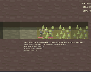
during the day the game has a orange filter over it, it's way more green with that tint off
I love the colors! The visuals are really nice, and my only real complaint is that it's hard to tell what's fighting and what's background at night.
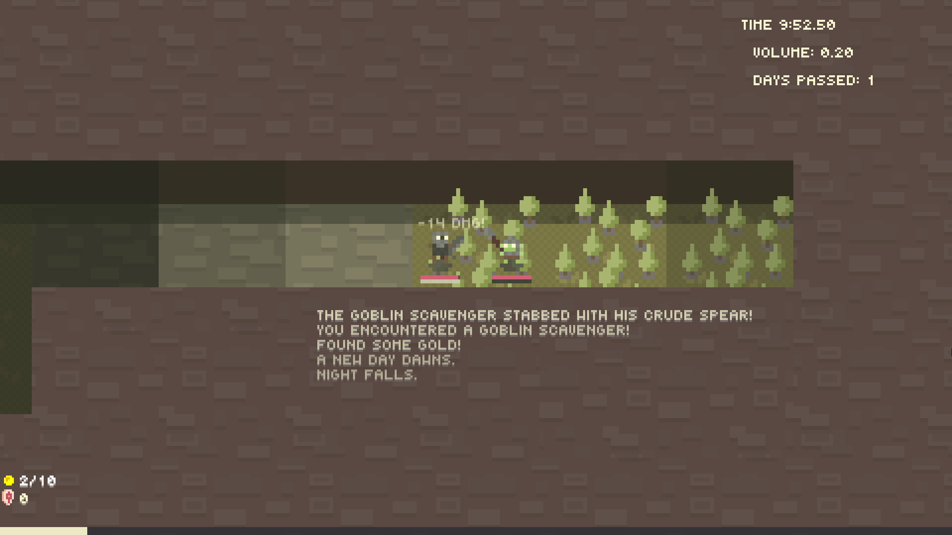
I think something's off with the time placement? It's not aligned with volume and bumps really close to the edge.
It also feels like everything's piling up on the top of the screen. The buttons are weirdly uncentered, could center them relative to the friendly health bar but it doesn't seem like it? The health bars look kinda off thanks to the level display.
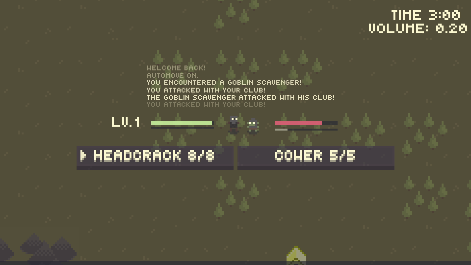
Combat feels nice, sounds nice. I think the game loop is okay? nothing jumps out at me as being off.
i just chose random offsets for volume and time because they were literally offscreen after i added the text explaining what the numbers were. i can probably make it lighter at midnight-ish.
>It also feels like everything's piling up on the top of the screen.
i mean there are supposed to be four buttons onscreen, i just haven't implemented them
>The buttons are weirdly uncentered, could center them relative to the friendly health bar but it doesn't seem like it?
how's this
>The health bars look kinda off thanks to the level display.
what's wrong with them? not sure what you mean
>Combat feels nice, sounds nice. I think the game loop is okay? nothing jumps out at me as being off.
I mostly meant that the level made it seem lopsided. It turns out it is actually lopsided, but that wasn't the point. Moving the level indicator below or above the health bar could make it look balanced like I did in the pic, or adding some other indicator to the goblin. Or move the whole thing right slightly. Or do nothing. it's pretty serviceable as it is.
Unless I missed something, it looks like the only thing you can do right now is go around the map fighting goblins.
Given that, there's just not much to say at the moment. Because there is no penalty for resting as soon as you are able to, I basically got to level 6 by just spamming Club attacks until I got the prompt to Rest, which I did immediately.
I then tried to play a little bit more strategically by switching between Club and Cower; it SEEMED like the damage I did varied on where the goblin's energy meter was at, but I'm not sure (maybe show damage numbers?), but again strategy didn't matter as you can just rest without any penalty.
It's hard to say whether the combat is good or not because it's just too bare bones at the moment. I'd like to see more before I have a solid opinion.
yeah this is basically just to get feedback on how the interface, the art and the combat loop feel. i guess i could penalise XP gained for the first few hours after resting, or give you a bonus to XP gained the longer you go without resting or give it a camping supplies cost or something.
cower and club are functionally identical apart from the number of charges they get, attack damage is just slightly randomised.


Comments
haven't watched the video yet but are you using a 60hz display
Yes
> I would just add some animation when you enter a fight, it's a bit jarring to immediately enter it.
coincidentally i have just been working on a fade-in/fade-out for battle transitions lol, great minds think alike
>And when I level up, show some visual effect on the screen.
do you have any suggestions? like a banner at the top of the screen or an animation on the player character?
are you on a 60hz display btw, because i keep noticing other people's versions of the game run a lot faster than mine
Since you wanted criticism on the art and not the gameplay:
Typical lowest effort possible 'indie' pixel art- nothing stands out, a game like this will need to ride on the gameplay, if no graphical update nor story is intended. There's nothing inherently wrong with each sprite, but the characters blend into the background and everything is overly low visibility. Not sure why there's a coniferous forest on a savannah-colored map, either; you could assume it's dirt, but there's obvious attempt at a full grass texture with the sparse pixel lines. Doesn't really make much sense. If you intended for it to be fall, reflect that in the tree colors. Viroa covered the rest of the issues I noticed outright- and don't be so defensive to criticism.
>Since you wanted criticism on the art and not the gameplay:
interface, art and gameplay loop, feedback on there not being any move or enemy variety just isn't helpful rn, though suggestions for future enemies or moves is more than welcome
>the characters blend into the background and everything is overly low visibility.
the characters are supposed to blend into the tiles, if you think the UI (stat bars, text, etc.) is too difficult to make out that's an actual problem
> Not sure why there's a coniferous forest on a savannah-colored map
during the day the game has a orange filter over it, it's way more green with that tint off
>don't be so defensive to criticism.
i'm not being defensive at all lol
I love the colors! The visuals are really nice, and my only real complaint is that it's hard to tell what's fighting and what's background at night.
I think something's off with the time placement? It's not aligned with volume and bumps really close to the edge.
It also feels like everything's piling up on the top of the screen. The buttons are weirdly uncentered, could center them relative to the friendly health bar but it doesn't seem like it? The health bars look kinda off thanks to the level display.
Combat feels nice, sounds nice. I think the game loop is okay? nothing jumps out at me as being off.
i just chose random offsets for volume and time because they were literally offscreen after i added the text explaining what the numbers were. i can probably make it lighter at midnight-ish.
>It also feels like everything's piling up on the top of the screen.
i mean there are supposed to be four buttons onscreen, i just haven't implemented them
>The buttons are weirdly uncentered, could center them relative to the friendly health bar but it doesn't seem like it?
how's this
>The health bars look kinda off thanks to the level display.
what's wrong with them? not sure what you mean
>Combat feels nice, sounds nice. I think the game loop is okay? nothing jumps out at me as being off.
ty
Buttons look fine now.
I mostly meant that the level made it seem lopsided. It turns out it is actually lopsided, but that wasn't the point. Moving the level indicator below or above the health bar could make it look balanced like I did in the pic, or adding some other indicator to the goblin. Or move the whole thing right slightly. Or do nothing. it's pretty serviceable as it is.
yeah i can move it to be on top of the health bar or just add a level value to the goblin, i get what you're saying now
Unless I missed something, it looks like the only thing you can do right now is go around the map fighting goblins.
Given that, there's just not much to say at the moment. Because there is no penalty for resting as soon as you are able to, I basically got to level 6 by just spamming Club attacks until I got the prompt to Rest, which I did immediately.
I then tried to play a little bit more strategically by switching between Club and Cower; it SEEMED like the damage I did varied on where the goblin's energy meter was at, but I'm not sure (maybe show damage numbers?), but again strategy didn't matter as you can just rest without any penalty.
It's hard to say whether the combat is good or not because it's just too bare bones at the moment. I'd like to see more before I have a solid opinion.
yeah this is basically just to get feedback on how the interface, the art and the combat loop feel. i guess i could penalise XP gained for the first few hours after resting, or give you a bonus to XP gained the longer you go without resting or give it a camping supplies cost or something.
cower and club are functionally identical apart from the number of charges they get, attack damage is just slightly randomised.