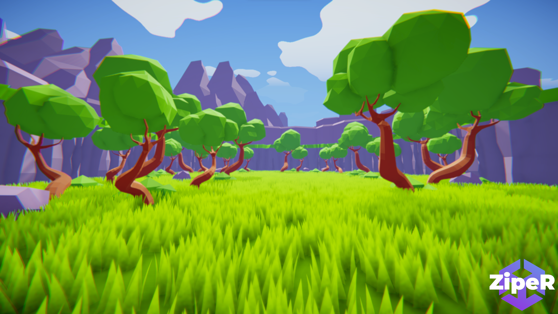
How can I improve the graphics in my game? Or does it look ok now?


I think it looks quite nice... minimalist, in a good way. The ground is quite flat though so a bit of variation there might be nice, or perhaps some more small rocks/bushes that are more at ground level.
It looks like you're going for a bright-colors style overall but I feel the purple mountains in the first two screens are a little intense. I wonder if some variation there, such as darker or more neutral colors, or deeper shadows would help.
One thing I really don't like, is the chromatic aberration. If there were an option to turn that off (as well as motion blur) then I think many people's sense of balance will thank you ^.^