Indie game storeFree gamesFun gamesHorror games
Game developmentAssetsComics
SalesBundles
Jobs
TagsGame Engines

Acheron is artistically challenged and it requires assistance.

A topic by TheNek created Apr 16, 2021 Views: 283 Replies: 4
Viewing posts 1 to 3
(+7)

The game is here : https://thenek.itch.io/acheron

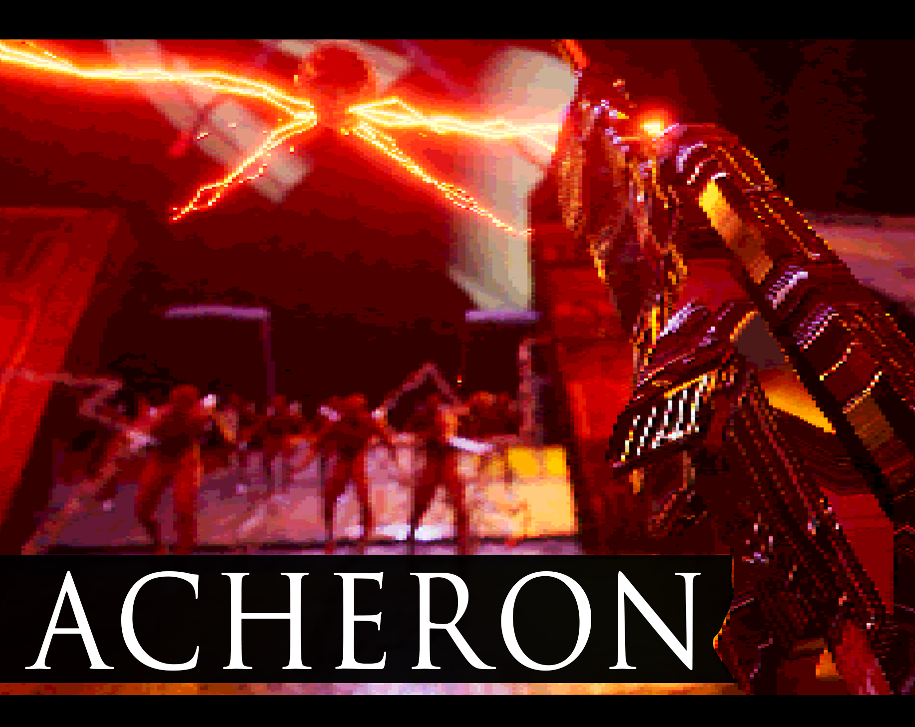
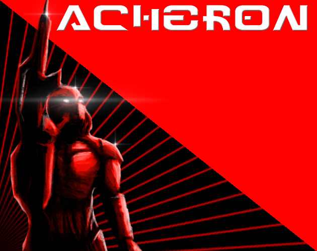
Hello folks, recently i have been changing the cover art of the game back and forth but can't decide which one is better or more eye-catching, would love to hear some opinion on it or if you just don't like either, lastly in case you have played the game which one fits better.

*CTR is pretty bad for both but i haven't tested enough.

Thank you for your time.

(+1)

I think the second one might be more eye-catching because of the bright colors, haha. So yeah.

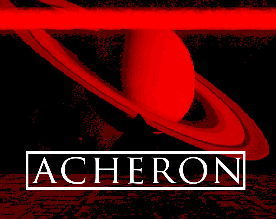
Thanks for the feedback, however i made this since then

i still think it needs some work but i see it as in improvement on the previous ones.

(+1)

Hi TheNek! I agree with Synzorasize about the bright colours! I also think that your new image looks pretty good. I think that the red triangle with the Acheron text looks a little too intense (maybe that's just me). You could try adding some textures in it to make it a little less in your face. Maybe add varying shades into the red and create an oil painting effect? Otherwise, solid job!

Thanks for the feedback, as a cover i agree with you its too intense, i'm planning on making a full illustration sometime in the near future, as a thumbnail though i'm not sure yet but i did see an improvement to my CTR(+0.7) since i've put it, so maybe the fact that it's intense is what makes it eye-catching, will do more tests though, thanks again.