


Play asset pack
A Samurai's Demise's itch.io pageResults
| Criteria | Rank | Score* | Raw Score |
| Documentation | #9 | 4.025 | 4.500 |
| Research & Development | #11 | 3.801 | 4.250 |
| Overall | #20 | 3.533 | 3.950 |
| Presentation | #23 | 3.354 | 3.750 |
| Creative | #24 | 3.354 | 3.750 |
| Technical | #27 | 3.130 | 3.500 |
Ranked from 4 ratings. Score is adjusted from raw score by the median number of ratings per game in the jam.
Judge feedback
Judge feedback is anonymous and shown in a random order.
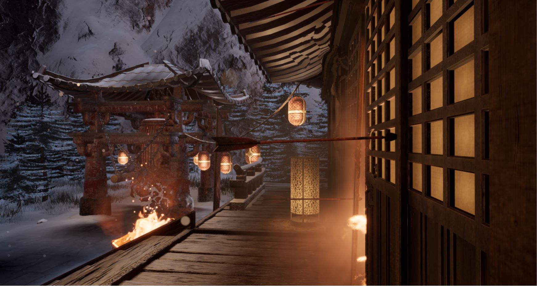
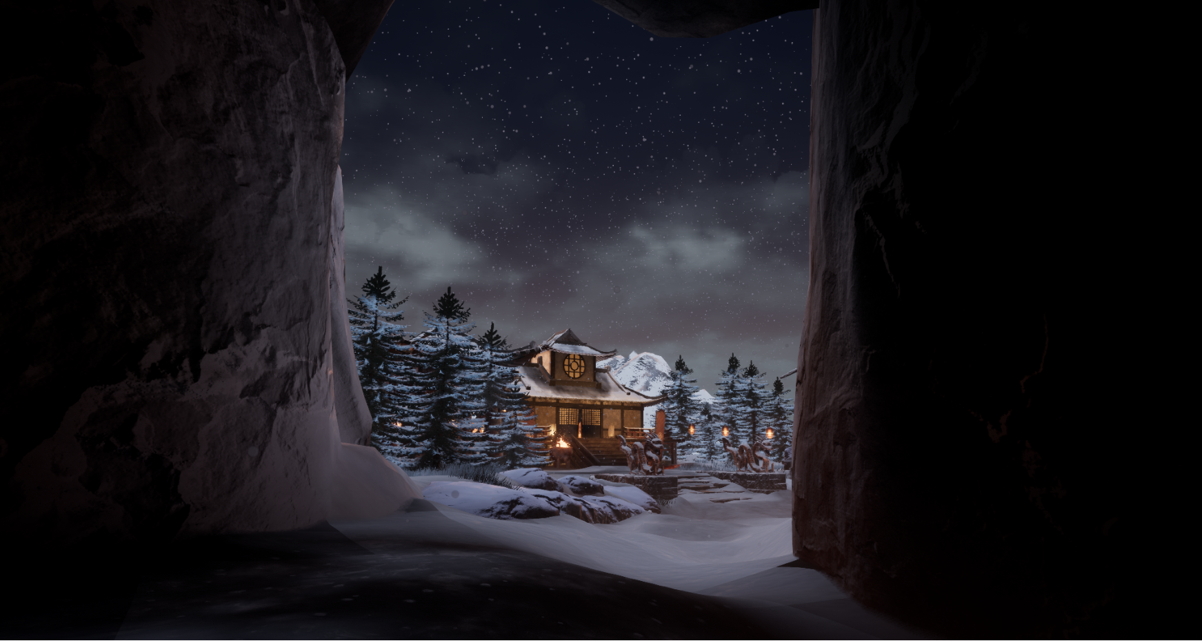
- Research & Development: You have a good split of references from lighting to the assets, scene, and key reference. I understand that you wanted to use this as an opportunity to see how far you can push your skills, however I would always advise making a few initial blockouts to get a sense of some kind of composition from the beginning because then you know that you’re working from a good foundation, even if you know it may change a great deal over time. I can clearly see that the relationship between your reference and the final art with what assets you chose to make, though it does appear as though you strayed a bit from your main reference which isn’t a bad thing per se, but from experience I know that by adding bits and bobs from various different references can end up making the final piece a bit muddled and less clear. Creative: I like the overall scene with the snowy landscape and building structures tied in with the layer of snow. The extra added bits of storytelling with the arrows in the wood & samurai plunged into the snow are nice additions, and the use of the lit lanterns being linked from one area to the other is a nice way to lead the eye around and create a warm contrast with the cold surroundings. One thing which I think would really push this further is really pushing the lighting to create a larger value range between the bright points (the lit lanterns/flames/glow from interior), to the darker areas with the surrounding trees in the background. The night sky could then highlight the trees to show off their silhouette, get nice cool highpoints, whilst having the main focus being put on the warmth of the building. Another thing I think which would help would be bringing back some of that red colour from the initial key reference to make certain things pop a bit more. Also, a reason why the key reference works so well is because of its simplicity in the composition; It has the bright fire at the base, stairs to lead your eye up, and the tree overarching to frame it all nicely. So it might be beneficial to look into further exploration with the composition to see if you can make it a bit clearer upon initial first glance. Technical: The documentation shows that you have a good knowledge of the workflow to take a variety of assets to final, and the method you used for creating the pine trees is really good to see and ended up with a nice overall result for the canopy. It’s also great to see that you took the time to retopo to keep the assets to game res. One thing I usually like to recommend is to understand and know how to adhere to a texel density target. This will resolve any issues of 1 asset looking ‘higher res’ than another when paired next to it since everything is using a similar amount of pixels per meter which ensures things are consistent. The other thing would be material definition, and understanding how PBR works and the importance of good values when creating the texture maps (highly recommend the PBR guide by allegorithmic free online pdf). Lastly, to help improve how to light a scene, the UE4 Lighting Academy videos on youtube by 51Daedalus is hugely helpful to get into a good mentality for lighting scenes nicely. Presentation: Everything is well presented, the screenshots are done nicely and the video is a good addition, I especially liked that you included a dev timelapse to see how it progressed over time (These are always good to do, if used in portfolio I’d suggest separating or simply swapping the order to final and then the time lapse). Unfortunately the final scene wasn’t in the downloadable project file, but did include the asset level to show everything used which was good to see. For final render screens also, it can be good to use the cinematic camera inside UE4 to take them. They allow you to change the lens/depth of field on them and I’d advise spending a good amount of time really composing every single screenshot to make them as interesting as possible. Documentation: Documentation is super in depth, and covers everything about the project including workflows, reasonings/commentary, mood board etc, and the video shows the working time lapse of how you arrived at the final piece… Nicely done! I would like to mention that wherever possible if you can say what you need to say to get your point across in a smaller amount of words with an accompanying image then that’s always great, as the aim is to be clear and concise with things like this. I personally like to do the same and write things out in full to describe as much as I can, but I know that it can sometimes get a bit lengthy. I enjoyed reading through it though and seeing your thoughts about how you approached things :)
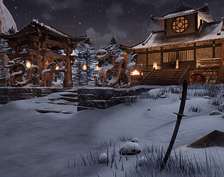
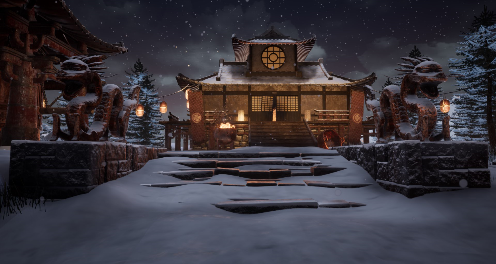
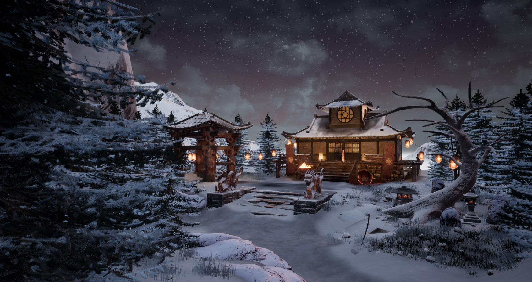
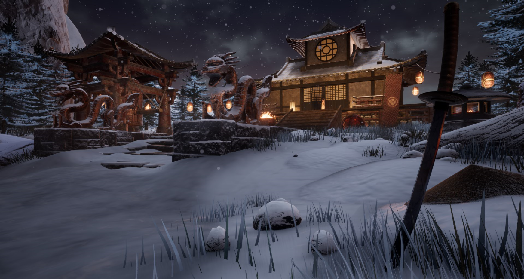
- Artist – Benedict Gibson Category: Sumo Digital Rising Star Assessor: Anthony O Donnell – Lead Artist at Firesprite Work name: A Samurai's Demise It was great to see the Benedict's growth as an artist since last years entry and how he responded to the feedback. There was only access to the props map. The level map was not present in the submission. Research and Development /Documentation The document is extremely well presented and goes into great depth detailing the production process and reasoning behind creative decisions. Reference was carefully considered and understood by the artist as to why it was chosen and the impact it would have on the scene. Reference was organised well by a category defined by it's visual contribution to the work. Technical Art Care was taken to produce optimal game meshes as per the dragon example. Decimation master can be used at times and is great for rocks. In this instance given the dragons forms it was a good call to go with quad draw. Items of the architecture such as the wooden planks, decking and concrete were baked but could really have used tiling textures like other assets. A general rule of thumb to help you decide is asking if the asset has any very specific details that require a baked map such as damage in a certain area or if it's not possible to achieve with a tileable. If so then use baked if not tileables should always be first choice as it's more efficient in both memory and production time time as an artist. The workflow and execution of the pine trees was handled very well. Channel packing was used but textures were not set to Linear. Materials and Textures The use of the dithered blend to sit assets better in the scene is a nice touch. Material definition was handled well there's a good bit of variation of roughness across the props with some considered detailing such as the dirt build up on the bell. Creative Art It's a very strong piece with some well made elements produced. The lighting is quite good but could be adjusted and improved to call out the elements in the order defined by the artist in the production diary (5.4) Final Presentation Overall it's a very ambitious scene for the time frame and has been produced well with really strong final images. As called out at the end of the production diary the sword is not separated enough in the final images to be called out as a key focal point. A way to address this would be a lantern or "faked" bounce from the snow back lighting it from behind and a soft fill front left to call it out better. For me the focal point being the buildings which are nicely called out by the warmer lights I would have reduced the ambient light in the rest of the scene into the darkness of the night to draw the focus around this area of warmth. Some of the shots drag the eye outwards to the cliffs / forests which are not the main focus. Some of the shots that use the bell / cliffs as a framing device work really well.
- I can see that you spent time researching and gathering reference before you began and that you had an idea in mind of what you wanted to achieve. The amount of assets you have created is impressive and each one is consistent in terms of sculpting and texturing. I watched the timelapse of your block out; it was good to see the progress you made over time and that you paid close attention to narrative and composition throughout. Having said that I wouldn’t have even seen/paid attention to the sword in the foreground unless I read your supporting document. I think this is because the light on the buildings draws your eyes there first. I then look left to the dragon and the direction they are facing in (along with the lines created by the steps) to an empty area of snow. The point of the hat almost hints to look upwards to the building too. Good use of tiling textures and world building. The snow could have done with more detail to really help show clumps and depressions in it. The lighting does look a little flat; having a weaker/no directional light would have given the scene more contrast and given it more mood. Really good piece though and well rounded. Well done!
Challenge Tier
Sumo Digital Rising Star
Leave a comment
Log in with itch.io to leave a comment.
Comments
Research & Development
Research shows nice high quality references. References have been divided to different sections. Did you lose the sight of main reference? You seemed to add quite a lot of very different elements to the scene.
Development of the scene is not super well documented in the pdf but video adds to it. Props are broken down well.
Creative Art
The scene showcases a nice snowy landscape with interesting buildings and supported time of year.
Assets could be pushed further with closer look at references, looking at how objects are built, adding irregularities and pushing the material work to read and feel more cohesive.
Technical Art
Objects have been scaled on the asset level, and probably also within scene, to look coherent and consistent. Polycounts seem optimized. Architectural modules could be pushed to the next level with irregularities and taking a closer look at how things are constructed. Ceiling modules are not waterproof, which feels a bit of a waste, as they read and look good, and could really use those elements not to break the immersion of real world and lose it to the realm of 3D. Lantern also moving all around with grass shader might not be the best call based on its structure.
Snow shader adds to objects. The fact the snow disappears up close is not a great thing. Pivot placement is a bit weird, and doesn't seem to follow a good logic to them.
Documentation
Different stages have been broken down well. It could be maybe done on a bit more general level, as now everything seems to be documented.
Final Presentation
Images are of high quality and show the subject matter. Video is a nice addition. The project file is missing the developed level.
Hi thanks for your feedback, it is really helpful. Just out of interest did you manage to access the final level because it seems you were able to breakdown features only found within unreal (i.e. grass shader used for lanterns). I tried downloading it myself and am surprised to also not find the final developed level!
Anyway, thanks again, I notice you're grinding through others projects and I'm learning lots about how to look for and give feedback from your comments. Cheers.
Hi there.
No, the level showcased wasn't unfortunately in your delivery. It did include a level called 'Asset zoo', which I'm basing my breakdown on that Technical Art regard.
Okay cheers, thanks for the quick response.