Play game
Blackout's itch.io pageResults
| Criteria | Rank | Score* | Raw Score |
| Presentation | #2233 | 2.903 | 2.903 |
| Originality | #2526 | 2.935 | 2.935 |
| Overall | #2711 | 2.720 | 2.720 |
| Fun | #3230 | 2.323 | 2.323 |
Ranked from 31 ratings. Score is adjusted from raw score by the median number of ratings per game in the jam.
How does your game fit the theme?
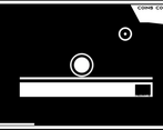
Your field of view and health are joined together, so the lower your health, the less you can see.
Did your team create the vast majority of the art during the 48 hours?
Yes
We created the vast majority of the art during the game jam
Did your team create the vast majority of the music during the 48 hours?
Yes
We created the vast majority of the music during the game jam
Leave a comment
Log in with itch.io to leave a comment.


Comments
This was a really cool concept! The look of the game and the music were great, a solid blend of sound design and simple visuals that created a great overall feel. I managed to get nine coins, I'm not sure if there were more but that was my best run! In a way, the shrinking frame reminded me of last year's theme, which was fun! A cool take on two connected aspects of the game. Good job!
I love the concept so much. graphics are minimalistic and looks good.
that's cool idea for the game and i love minimalistic style! maybe it seems a bit 'unfair' that i have to take damage - but at least it is showing me mechanics. maybe instead of forcing to take damage you can make it just very hard - but possible - to avoid?
I was going to complain about the forced damaged, but the core concept of reducing your vision wouldn't be so intriguing otherwise. Having to explore the levels through several runs so you know where you go without seeing is an interesting mechanic!
Nice and clean art style, looks very stylish. loved it. ~ Check out my entry when you get time :D
Superb monochromatic presentation! Looks really cool. I also like the idea but I wish the platforming had more variation
Interesting, a little weird approach to the theme, but I do like it. I didn't rate very high on originality because I don't think it made a very big difference to the platformer mechanics, just gave it a different kind of death spiral. It was reasonably fun and well presented though.
Nice game! As a head up though when I played it in fullscreen I think the UI was bugged- the black out overlay only covered the center part of the screen for me, I could see around it. Might be something you'll want to look into if you plan to work on this more. Still, great work.
Nice game but no relation with the GMTK theme.
The connection is that the health and FOV are joined togther
Now I get it. Thanks.
No problem!
Cool game, though I think the jump should be at space.
Nice and clean art style, looks very stylish.
pog ncei game