

Play asset pack
[VFX] Zoomies n Boomies's itch.io pageResults
| Criteria | Rank | Score* | Raw Score |
| Research & development | #2 | 4.250 | 4.250 |
| Documentation | #2 | 4.250 | 4.250 |
| Presentation | #2 | 3.625 | 3.625 |
| Creative | #2 | 3.625 | 3.625 |
| Technical | #2 | 3.625 | 3.625 |
| Overall | #2 | 3.875 | 3.875 |
Ranked from 8 ratings. Score is adjusted from raw score by the median number of ratings per game in the jam.
Judge feedback
Judge feedback is anonymous and shown in a random order.
Really good effort with excellent example of research and developing the ideas In terms of areas to improve on, here are few:
Visuals: You could look at adding more impact to the explosion by ramping up bloom on a post process. Also, have the explosion elements come out from the centre faster and then slow down more with damping so that they cover the same space. This will make it look like the explosion has more power.
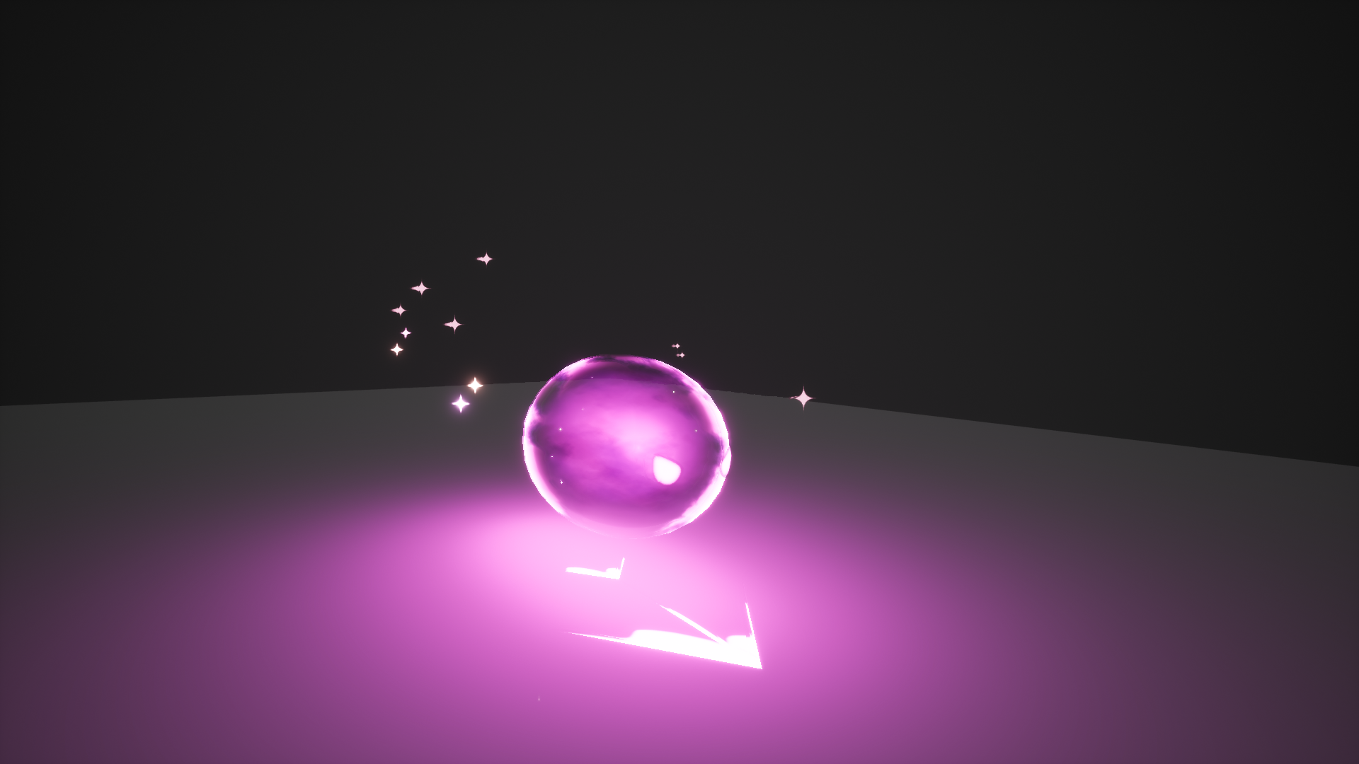
Technical: Using a depth fade on your sphere material will give you a softer edge where it intersects with the ground, making it less obvious that it's a polygonal sphere.
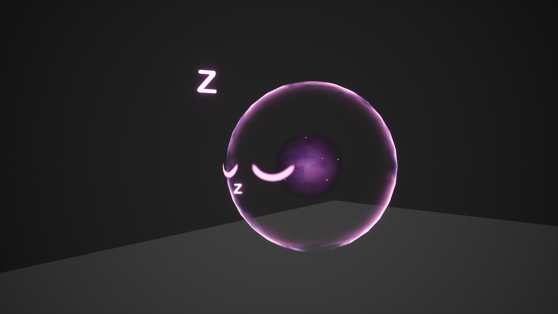
Presentation: It was quite hard to see the the sphere waking up visuals because it was quite far away in most of the shots. Perhaps consider showing it close up in one shot. Also, Presenting in a plain dark background is a good idea as it shows the effect off well, but you would get extra credit if you could also show it in a representative environment.
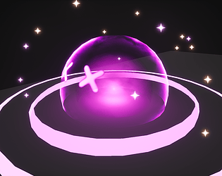
Love this effect, it's visually simple but has a lot of nice detail that all subtly works together.
The sleeping idle is very interesting and unique and I think you pulled that off wonderfully, it transitioning to the surprised state with the panic-esque eyes rolling all the way around is a great method of transitioning it from idle > surprise > travel. I also like the explosion at the end, but I feel like with the explosion in particular, there are a couple of things that could be looked at.
First of all, I'd like to touch on the presentation, whilst you have a floor of required length for the character to move, unfortunately the rest of the world is an endless black void. When presenting VFX, you generally want to avoid using pure blacks and small spaces. Something like a grid material in this video
or something simpler with a grey floor and fog in the distance to cut off the hard-edges where your floor ends would be much more preferred. I prefer to use grid material so that if I use any form of distortion, it can be visible clearly, this would otherwise be invisible on a pure black background and hard to see on a pure grey background.Moving on, I noticed whilst looking through your emitters that you sometimes duplicate basic things like sparks into seperate emitters. Whilst there's nothing technically wrong with that as far as I'm aware, it can begin to clutter your workflow in the future when you have to scroll through numerous emitters that do the same thing. Instead of having one spark emitter that sends sparks z200 and another emitter that sends them z150 for example, you may be able to simplify your systems by using a uniform velocity of max z200 and min z150. Same for your lifetime modules, I see on PS_Boom you use two emitters with one having a lifetime of 2 seconds and another at 2.5 seconds. Setting a uniform to have min 2 secs and max 2.5 seconds would make your systems more readable.
Adding on to that, you should really be actively looking to name your emitters, it doesn't have to be an overly complex naming system, just enough so that either you or someone you share your work with can quickly identify which emitter does what such as in https://imgur.com/a/MJlUc
Now to get on to the actual effect. I think there are areas you could look at again to improve further. The first thing that I'd say is that the core of the character is somewhat plain, though of course this could be by design. To me, I think it'd look more visually impressive if the core was somehow more active, or 'full'. You could maybe achieve this by increasing the opacity and spawn rate of the sparks that spawn within the inner section to create a more star based look. Currently, from a distance you cannot even tell that there are sparks on the inside of the character. At the same time, I think the character would look more bubbly and cute if it's inside wasn't so empty aside from the dark core he has in the center. Perhaps a slight overall shade of pink/purple to the entire character?
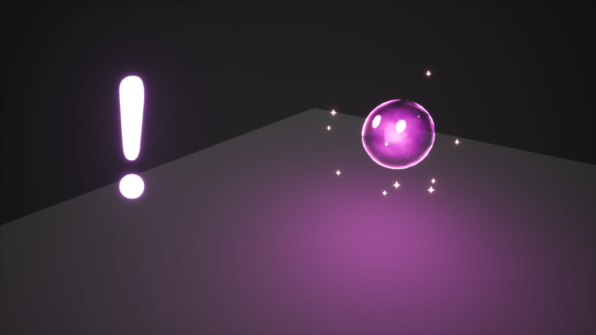
The 'surprise' section is good but without an influencing factor for the actual surprise, it comes off a bit strange. I think it would be more interesting, albeit slower, if the character was surprised and then launched himself back into the charge attack. At the moment, I feel that the transition from idle to attack mode is too sudden, and to me that somewhat loses the impact of the character being surprised.
Also with the character launching itself backwards, it might benefit to increase the spawn rate of the sparks that appear around the character and setting them to Local as they currently are attached to the character whilst it's launching itself backwards.
In terms of the explosion, the only real suggestion I would make is in your material. I would suggest looking at implementing a depth fade node in there to prevent the material visually hard-clipping into the floor on some of your explosion materials.
Aside from all that, wonderful work, I look forward to see what you make in the future, and don't be afraid to reach out in the future if you need more critique.
This is a decent effort from a candidate who is very new to VFX processes, and who had a limited time-frame in which to complete the task.
The idea itself was refreshing to see, as the candidate was brave enough to try something a little different.
Colours are very saturated to the point where they don't really echo the pastel shades of the moodboard. I would have loved to have seen those pale blue colours find their way into the final effect too - it all looks a little too monochrome compared to the nicely done sketches. Some of the elements - like the shockwave - are a little basic in their execution.
I'm confident that with more time/experience, and having learned a lot from this process, the candidate would be able to get closer to the idea they originally pitched.
I liked the visual appeal of this effect and thought the ground streak and glow was particularly effective: this element particularly feels vibrant and energetic. Simplicity is key in the cuteness style of this effect however, in effects, the detail needs to come through with more varied timing between the elements and extreme snappiness. The burst effect animation is too long and doesn't convey a drama. Referring to the 12 principles of animation in the research was good and certainly helped but needed much more.
I didn't feel that the overall look of the final effect matched the researched style, the mood boards and production sketches looked softer and the final effect looks more like it would be more at home in a modern take on retro gaming (perhaps Pacman DX). Previewing an effect out of context i.e. against black gives a false representation of the impact and colours and this effect would really have benefitted from an environment more similar to that used in the documentation and mood boards.
The documentation and production blog gave a good insight into the processes used.
The animation is really fun and enjoyable to watch, the rings that get emitted could have a little more detail added to them, great job.
Think you nailed the animation. Good use of pace and key framing.
Blends nicely with the little discrepancies like secondary and tertiary particles.
Love the trail at the floor, really makes a difference, but the floor could be worked on with some displacement or texture.It would be nice to see the effect shadow flying over texture floorYou went into a certain direction and you kept on track which is a good job overall, but I wold like to see more iterations, or spend more time with the effect.
If you had more time you could have added a little bit more detail on the propagation of the effect (Like a wave or a slide ramp, to add just a touch more of trail Z depth).
Perhaps in the sphere a little more of noise with mild or subtle differences in the RGB (soap shader).The perfect balance between simplicity and character, the animation creates the intended effect and demonstrates good balance of power and timing. The colors and expression work well together and the particles are sufficient to not overpower the effect. The presentation has good contrast and can be read well with a thought out production plan and good concepting. I can easily see this in any third person game not just mobas. Keep up the good work and see you in the games industry.
Tibor Papp
Pixelwarp Studios
Nice try overall, good effort and good documentation. All stages need improvements to be great.
Put more effort on explaining with more info the step by step effect.
From the effect part i would love to see better blended the shapes when extracting the sphere.
Challenge tier
Undergraduate students graduating in 2019 or later
Leave a comment
Log in with itch.io to leave a comment.