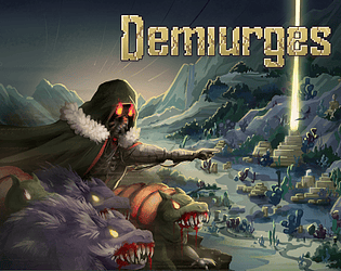
Play Demiurges game
Demiurges's itch.io pageResults
| Criteria | Rank | Score* | Raw Score |
| Sound/Music | #37 | 3.402 | 4.500 |
| Art / Graphics | #39 | 3.591 | 4.750 |
| Overall Fun | #43 | 3.213 | 4.250 |
| Controls / UI | #53 | 2.835 | 3.750 |
Ranked from 4 ratings. Score is adjusted from raw score by the median number of ratings per game in the jam.
Leave a comment
Log in with itch.io to leave a comment.


Comments
Hi! I just finished testing your game. The idea is really cool, just the game itself needs a lot of polishing. I am aware that it is still an early version though. I believe it will become a fantastic game over time.
Demiurges was fun to play despite the large amount of small flaws. I will describe them to help you get rid of them.
For a start I'd like to say that the atmosphere was very special - gloomy, but awesome! I like a lot the world you created, projects of heroes, units and town. Making fragments of the map connecting to form a one bigger place is a nice idea too.
I'll talk about map graphics now. Gentle mist around the obstacles are really nice to look at, I watched it for a while when I spotted it, haha.
Unfortunately, many places (at least on the first map, where it's quite dark) blend with each other. I think the issue is a small variety of brightness in colors there. I would recommend you to follow this advice: you can take a screenshot and paste it into a drawing program (like Krita - it's free and I personally use it), then decrease saturation to make it all in the shades of grey. That way you will see much better which elements needs to be more separated.
The music is very unique, gives the game very gloomy mood. I assume it was your target - the world is doomed after all. In that case music works really good! The only things I would complain about is that it lacks a variety a bit and that there's no separate battle soundtrack.
When it comes to other sound effects, I loved them all.
Overall I like UI, but there are things I don't understand about it. For example, animation and style of the left upper UI is very nice, but I completely don't know what's it for.
I think it wouldn't hurt to add some background under UI, even transparent one. When we are in the town resources indicators are a bit harder to read.
On the other hand, the whole UI when it comes to cards was cool and understandable for me.
I would love to be able to recruit all the creatures in one place in the town and I would really like to read about them before recruiting (I didn't see that option in the recruitment menu).
This game desperately needs a tutorial, but I guess you already know that.
Boss was much easier than I thought, I think you could make it a bit more difficult.
I didn't see the option to run from battle, maybe I missed something?
One more thing: I think that drawing a card would work better after we close the window showing us the time left.
It was a fun game, the concept is really awesome, it "only" needs a lot of polishing.
I am going through all submissions to make all developers aware of an important Google form I've made.
I'm joining the IQ folks to help organize smaller events in between the main FQ event in order to help prevent us from getting too many games in main events. Right now, I have a planned structure for these events but I would like to hear from everyone who was in this event in order to tune things better. The survey is a bit long, but it covers as much as I could think of. If you can take the time to do the survey by June 1st, I would immensely appreciate it!
You can find the form here: https://forms.gle/P9LPYwERhJtpZzteA
Hello from tonight's stream!
So, this one took me a bit to figure out though I did get it in the end and found it to be quite interesting and fun.
I think the primary thing needed in this game... is a tutorial. Normally I'm not one for tutorials, but I think it's valid here. There's enough complexity and lack of things told to the player to necessitate it. To give some ideas, here are things that happened to me and the order I had to learn those lessons
1. Did not understand the point of the cards in general and when they were used
2. Did not understand the point of the resources
3. Did not understand the specifics of cards and what they do
4. Did not understand the city was a thing you could visit and hire underlings for your army.
5. Did not understand that long range is a thing in the second area. Whoops!
6. Did not understand that the raptor AND the manta both require moving one space in battle before they can attack.
So yea, it'd be a good idea to teach people this.
Besides that, the music felt repetitive and certain parts of the UI hide other parts that shouldn't do that.
Hi! I was actually looking forward to playing this game for quite some time now. It seems like a ton of effort has been put into it.
UI:
Gameplay:
I spent several hours playing, and I haven't unlocked any of the side areas - because the only time I got to the key I accidentally destroyed it - So I don't know how much more content is there. That being said, there is a TON of content already, enough to be replayed several times. I feel like this would be the best time to refine existing content, UI, difficulty and whatever issues there are. The game is quite addicting and I definitely had tons of fun - it has the vibe similar to old Heroes games (Heroes II was still my favourite).
I hope this feedback helps you make the game even better!
Good luck! I'll be looking forward for more!