Love the concept . Fairly hard, but I felt like I was getting better at it each time I tried a run, so its probably just me slowly going through the learning curve.
Didnt run into any glitches.
Two quality of life things. It would be nice if the card im mousing over was drawn in front, currently I have to click and move it to see it, even if I dont necessary intend to play it. It would also be nice if you could move pinned posts, just to let the player reorganize the board as they like.
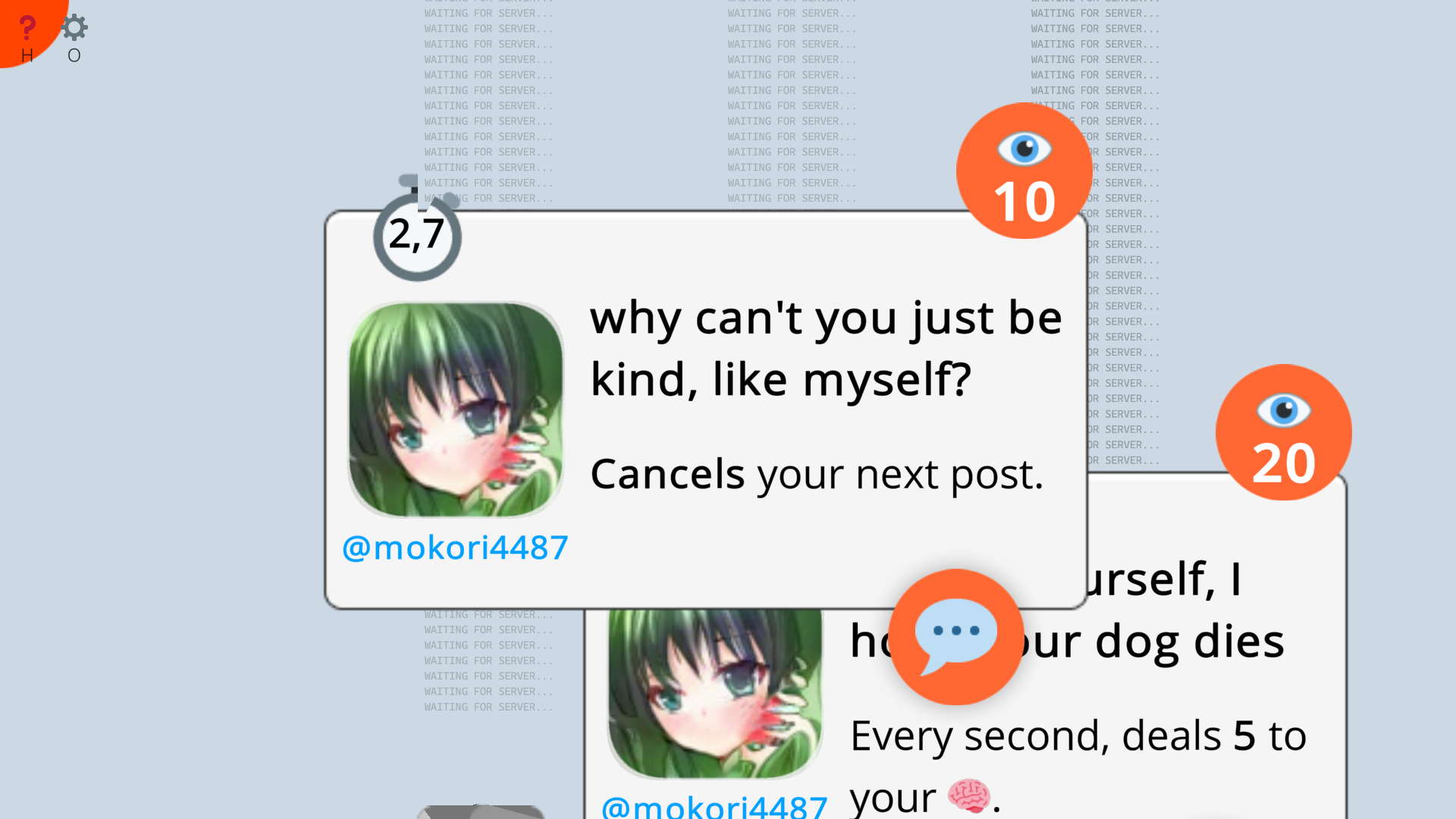
I think it would make sense to give reply cards a unique icon somewhere to distinguish them.
I wasnt a fan of starting with zero mana and only 3 cards. Felt like it makes the beginning a bit too slow.
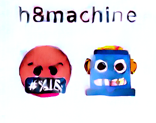
Im a big fan of the theme you have going, and you have done a good job in having the play styles of the cards match to the personalities they represent.
I've been working on this mouse over feature for a month now, and by "working" I mean remembering every now and then that I have to add it, it's just one line of code, so I'll do it next time I open the engine. And then forgeting about it next time I open the engine. I actually implemented it after reading this comment though!
I really like the mechanic of recycling cards to pay for others in that it balances narrow "counter" cards which end up useless in certain fights, which is nice because it felt like most of my deck consisted of cards like that.
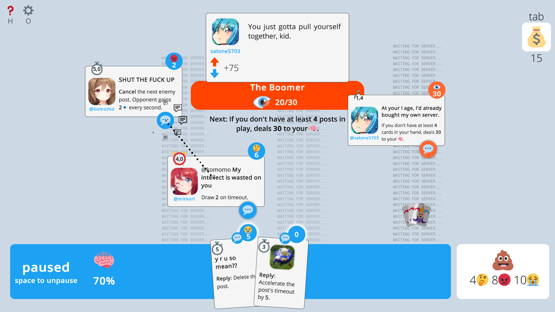
I liked the real-time part of the game, although I wish there was a clearer visual indication when the game auto-pauses after certain things happen like playing a card.
I think it would be nice to have a button that advances the time by 1 second when pressed without unpausing.
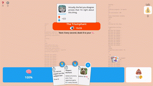
I love how each personality corresponds to its playstyle, although I felt like unique resources and unique card effects made draw rng even more important. Unlike games like slay the spire where most of the deck is variations of the basic attack/block, a lot of the cards here seem to be very situational. I found myself often stalling until I drew one of the few cards that actually damaged the enemy.
Heals seem pretty good and there doesn't seem to be much inevitability for enemies. I felt like, for some fights, I was is almost the same position 20 turns after removing enemy cards and healing myself. If these stalemate situations are caused by my own misplays, I'd rather the enemy just kill me eventually.
I kept wasting a draw with a full hand. Some kind of overdraw notification or hand-size warning would be nice considering the hand ui seems to have plenty of space even when the hand is full.
As others have mentioned, ui readability tweaks would go a long way in making the game easier to read (highlighting playable cards in hand, placing new posts where they don't overlap or cover other ui elements etc)
Love the flavor and theme of the game and looking forwards to a fleshed-out progression system
You're right here, I was concerned about mechanical identities but kinda forgot to add the simplest baseline damaging cards, in the process. The effect is that emojis I pinned down as "having healing" have too much of it. Notifications, highlights etc. I'm already working on!
Pretty much agreed with the others. The game has potential but the focus should be on making things neater / easier to understand. Some things like:
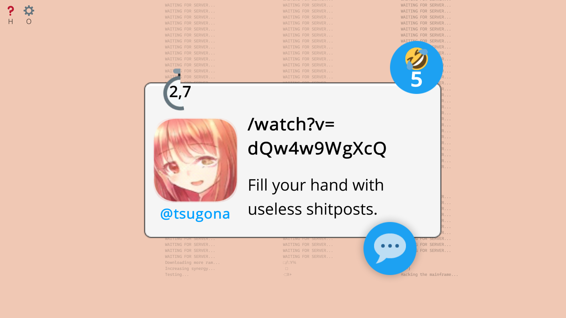
-The reply button is too small/not very clear when it becomes unselected automatically even though you may want to spam replies to a specific post. Make it so you can drag posts onto a post to reply to it instead? And of course have the card you're about to reply to highlighted so it's clear what you're about to reply to.
-Cards in your hand bunch up together instead of spreading out on your dashboard. Or rather, I think cards should be brought forward / highlighted so when you hover over a card you can see what it is without dragging it out?
-I'd say something about more effects/previews for what a card will do when you drag it out / play it but that's already half-way done with the beams that go from cards to other cards. Still would be nice if dragging a card over the discard showed you what resources you'll get, or dragging out a 'delete post' card while replying showed you the post is about to be deleted. Or a calculation of your emoji loss from playing a card while you have it dragged out / an error if you don't have enough.
-More structure to where posts appear and make the important parts of posts bolder. Because the board state keeps changing it can be hard to keep track of things, so having some loose organization like 'enemy cards this side, your cards this side' could help or making the timeout clearer (especially when it's about to time out) and maybe a tab hanging under posts for "EFFECT ON TIME OUT", maybe a tab on the right side of a post to say "EVERY SECOND", that sort of notation.
I'm sure you were going to work on some of the above already, but good luck!
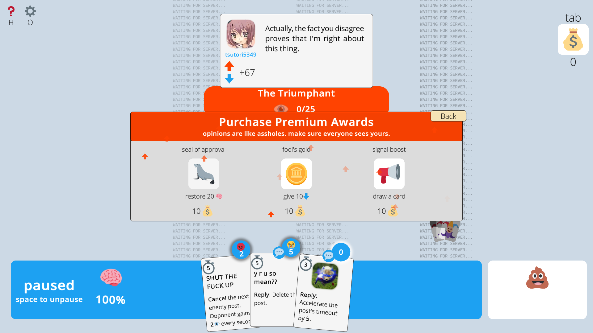
I love the concept of your game, but it is way too difficult to read what things do at a glance. I love the Emoji as mana idea, but the fact that the default hand spread covers up mana costs and symbols when they're all the same color is UX gore. Rather than showing all of the resources I have at the bottom right next to my trash, it'd probably be better to just show all my counts at all times; even if I have 0. And to grey out my cards that aren't usable. Because I find myself constantly trying to use posts that I can't. But the idea and general aesthetic execution here is phenomenal. This is a few smart design decisions away from being gold.
I like the idea of the game. I had a look but couldn't find the tutorial. I get the cards have a cost to play but missed where those values (my mana pool?) were on the screen. Looking at the screenshots it would be the poop emoji area?
Maybe if the player has 0 just show that, so they don't keep looking around.
For the cards I would suggest the card ability text the player needs to read clearer than the flavor text. At the moment it looks like you inverted that so I am reading the flavor text and not able to focus on the ability text.
The scrolling text in the background and the changing faces also make it harder to focus at least for me. So I would ask for an option to turn them off or to work at the general GUI to make it easier to know what elements to focus on the screen.
Pretty fun card game, I would highly recommend to other players playing the tutorial before jumping in. I will say that all the enemy posts spawning in the middle is annoying since you then have to move everything around to see them all. But I like the emoji currency system and how it plays. You have to actually make your deck better right at the start by focusing on one major emoji currency with a secondary one just like Magic the Gathering which is a nice touch. The music is generic open sourced music, would be nice if there was something else there, but it's fine since it's a place holder. I think you can make this into a full on game, you just need to make a lot of changes to refine it more as of right now it's really rough, but you can make this into something extremely great. This is the type of thing that would sell a bunch of copies.
Thanks for feedback! Tbh I actually thought of keeping Kevin MacLeod (with more tracks though) as a soundtrack because of his status as the meme music source on youtube.

Comments
Love the concept . Fairly hard, but I felt like I was getting better at it each time I tried a run, so its probably just me slowly going through the learning curve.
Didnt run into any glitches.
Two quality of life things. It would be nice if the card im mousing over was drawn in front, currently I have to click and move it to see it, even if I dont necessary intend to play it. It would also be nice if you could move pinned posts, just to let the player reorganize the board as they like.
I think it would make sense to give reply cards a unique icon somewhere to distinguish them.
I wasnt a fan of starting with zero mana and only 3 cards. Felt like it makes the beginning a bit too slow.
Im a big fan of the theme you have going, and you have done a good job in having the play styles of the cards match to the personalities they represent.
I think this has high potential to be a fun game!
I've been working on this mouse over feature for a month now, and by "working" I mean remembering every now and then that I have to add it, it's just one line of code, so I'll do it next time I open the engine. And then forgeting about it next time I open the engine. I actually implemented it after reading this comment though!
Been looking forwards to trying this one.
Love the flavor and theme of the game and looking forwards to a fleshed-out progression system
You're right here, I was concerned about mechanical identities but kinda forgot to add the simplest baseline damaging cards, in the process. The effect is that emojis I pinned down as "having healing" have too much of it. Notifications, highlights etc. I'm already working on!
Pretty much agreed with the others. The game has potential but the focus should be on making things neater / easier to understand. Some things like:
-The reply button is too small/not very clear when it becomes unselected automatically even though you may want to spam replies to a specific post. Make it so you can drag posts onto a post to reply to it instead? And of course have the card you're about to reply to highlighted so it's clear what you're about to reply to.
-Cards in your hand bunch up together instead of spreading out on your dashboard. Or rather, I think cards should be brought forward / highlighted so when you hover over a card you can see what it is without dragging it out?
-I'd say something about more effects/previews for what a card will do when you drag it out / play it but that's already half-way done with the beams that go from cards to other cards. Still would be nice if dragging a card over the discard showed you what resources you'll get, or dragging out a 'delete post' card while replying showed you the post is about to be deleted. Or a calculation of your emoji loss from playing a card while you have it dragged out / an error if you don't have enough.
-More structure to where posts appear and make the important parts of posts bolder. Because the board state keeps changing it can be hard to keep track of things, so having some loose organization like 'enemy cards this side, your cards this side' could help or making the timeout clearer (especially when it's about to time out) and maybe a tab hanging under posts for "EFFECT ON TIME OUT", maybe a tab on the right side of a post to say "EVERY SECOND", that sort of notation.
I'm sure you were going to work on some of the above already, but good luck!
I love the concept of your game, but it is way too difficult to read what things do at a glance. I love the Emoji as mana idea, but the fact that the default hand spread covers up mana costs and symbols when they're all the same color is UX gore. Rather than showing all of the resources I have at the bottom right next to my trash, it'd probably be better to just show all my counts at all times; even if I have 0. And to grey out my cards that aren't usable. Because I find myself constantly trying to use posts that I can't.
But the idea and general aesthetic execution here is phenomenal. This is a few smart design decisions away from being gold.
Thx, already working on a better hand spread and highlighting playable cards!
I like the idea of the game. I had a look but couldn't find the tutorial. I get the cards have a cost to play but missed where those values (my mana pool?) were on the screen. Looking at the screenshots it would be the poop emoji area?
Maybe if the player has 0 just show that, so they don't keep looking around.
For the cards I would suggest the card ability text the player needs to read clearer than the flavor text. At the moment it looks like you inverted that so I am reading the flavor text and not able to focus on the ability text.
The scrolling text in the background and the changing faces also make it harder to focus at least for me. So I would ask for an option to turn them off or to work at the general GUI to make it easier to know what elements to focus on the screen.
The tutorial is on the "pick emoji to start the demo" screen. Thanks for feedback!
Pretty fun card game, I would highly recommend to other players playing the tutorial before jumping in. I will say that all the enemy posts spawning in the middle is annoying since you then have to move everything around to see them all. But I like the emoji currency system and how it plays. You have to actually make your deck better right at the start by focusing on one major emoji currency with a secondary one just like Magic the Gathering which is a nice touch. The music is generic open sourced music, would be nice if there was something else there, but it's fine since it's a place holder. I think you can make this into a full on game, you just need to make a lot of changes to refine it more as of right now it's really rough, but you can make this into something extremely great. This is the type of thing that would sell a bunch of copies.
Thanks for feedback! Tbh I actually thought of keeping Kevin MacLeod (with more tracks though) as a soundtrack because of his status as the meme music source on youtube.
That makes sense