

Play asset pack
Giant's Pass's itch.io pageResults
| Criteria | Rank | Score* | Raw Score |
| Documentation | #13 | 3.175 | 3.667 |
| Research & Development | #14 | 3.175 | 3.667 |
| Overall | #19 | 2.771 | 3.200 |
| Technical | #19 | 2.309 | 2.667 |
| Presentation | #20 | 2.598 | 3.000 |
| Creative | #21 | 2.598 | 3.000 |
Ranked from 3 ratings. Score is adjusted from raw score by the median number of ratings per game in the jam.
Judge feedback
Judge feedback is anonymous and shown in a random order.
Szymon has made a great start to this environment in 2 weeks. It was really nice to see the reasoning behind the project choice and the importance of having own goals to improve as an artist.
The documentation shows it was well researched and it was great to see Szymon looking in to specific studios techniques in depth.
There was a great use of mood boards for different purposes, along with the colour palette exploration, really good to see this was all considered.
Szymon demonstrated a good technical knowledge of modelling, texturing and material creation, with well thought out planning of how the environment should be constructed. With a bit more time, I'm sure this environment would make a great portfolio piece!
Submission Title: Giant’s Pass
Submission Tier: Sumo Digital Rising Star
Assessor: Anthony O’Donnell Lead Artist Firesprite
As this piece is listed as being “in progress” I’ll review as such. Submitted was a production diary and some asset files.
Concept design & Development:
It’s still early days. The reference gathering thus far has been good. Following the GOW production processes will be of benefit and hopefully shed light on new techniques for the artist.
Technical Art:
In general 4k textures are likely not going to be used for every asset in a production. Where possible aim to use tileable textures and trim sheets. Save uniquely baked textures for hero props or atlas sheets of smaller props.
The use of trim sheets and channel packed textures early on is a good start. In general smaller assets like the axe consist of too many polygons where the boat could do with more given its relative size.
Things to watch out for going forward are:
- Maintaining a consistent texel density across the scene and not just per prop.
- Polygon distribution in general could be improved. One example being the very smooth rivets on the shield which are barely noticeable VS the shield itself which could do with a few more edges to smooth the silhouette. I’d half the edges on the rivets and spend it on the larger shield surface. You’d likely end up with a net saving.
https://80.lv/articles/textel-density-tutorial/
https://lesterbanks.com/2018/06/texel-density-maya/
Creative Art:
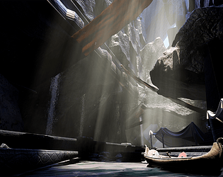
The focal point highlighted in the concept image is not actually where my eye is lead to. I tended to be drawn to the lighter / higher contrast area to the left of this on the “platform / quay”.
A suggestion would be to add a statue or suitable contextual hero prop in this area.
The shield has nice worn paint /exposed wood areas due to wear and battle damage, this runs along the grain and looks natural the damage wear on the boat runs across the planks and grain diagonal to the ships likely direction of travel. Refer back to the reference and investigate the kind of weathering / wear the ship would have.
Aim for the architectural elements hue and value to contrast against the darker rock so there’s a clear definition.
Written Documentation:
The current scene progress has been discussed in a clear and simple production diary.
Final Presentation:
Currently the images are a touch too dark in areas meaning some of the architectural details are lost. A stronger ambient light via a skylight / indirect lighting would help with this.
The god rays are intense and too plentiful. I’d hold off on adding post effects and other screen effects until the environment is further along. These elements should be additive to the overall image and not a focal point (unless its strongly intended).
The recent GOW game did use more saturated colours, it would be worth taking a look at this game and the art book.
Best of luck with the rest of the project. It’ll be good to see how it progresses.
Challenge Tier
Leave a comment
Log in with itch.io to leave a comment.